
iOS UI 開發實用手冊:UILabel 與 UIButton 屬性全解析
UILabel 與 UIButton 是最基本的兩個元件,但屬性多、細節碎,很多行為不查文件根本想不到。本文把它們常被忽略的屬性整理成一份可查閱的對照筆記。
一、UILabel 的初始化與基本設定
UILabel *myLabel = [[UILabel alloc] initWithFrame:CGRectMake(40, 40, 120, 44)];
[self.view addSubview:myLabel];
1. 設定文字
最單純的 text 屬性:
myLabel.text = @"標籤文本";

需要局部樣式時改用 attributedText(iOS 6.0 起提供):
NSString *text = @"其實沒什麼";

NSMutableAttributedString *attributeString =
    [[NSMutableAttributedString alloc] initWithString:text];

[attributeString setAttributes:@{
    NSForegroundColorAttributeName : [UIColor redColor],
    NSFontAttributeName : [UIFont systemFontOfSize:17]
} range:NSMakeRange(2, 1)];

myLabel.attributedText = attributeString;

實務中最常見的場景是「關鍵詞標紅」。與其硬寫 NSRange 數字,不如用 rangeOfString: 動態查找:
NSString *keyword = @"腳本";
NSString *result  = @"本站腳本站";

NSMutableAttributedString *attrituteString =
    [[NSMutableAttributedString alloc] initWithString:result];

// 動態取得關鍵詞的位置與長度
NSRange range = [result rangeOfString:keyword];

[attrituteString setAttributes:@{
    NSForegroundColorAttributeName : [UIColor redColor],
    NSFontAttributeName : [UIFont systemFontOfSize:17]
} range:range];

label.attributedText = attrituteString;
注意:一旦用了 attributedText,後續再改 font 或 textColor 都不會生效,必須改 attribute 本身。
2. 字體、顏色、對齊
myLabel.font = [UIFont systemFontOfSize:13];
myLabel.textColor = [UIColor blueColor];
myLabel.textAlignment = NSTextAlignmentCenter;
對齊方式共有五種可選:
NSTextAlignmentLeft        // 靠左
NSTextAlignmentCenter      // 居中
NSTextAlignmentRight       // 靠右
NSTextAlignmentJustified   // 最後一行自然對齊
NSTextAlignmentNatural     // 依腳本預設方向
其中 Justified 與 Natural 在部分情境下會引發崩潰,使用時務必實測。
3. 文字截斷方式
NSLineBreakByWordWrapping       = 0,  // 以空格為界,保留整個單詞
NSLineBreakByCharWrapping,          // 允許切斷字符
NSLineBreakByClipping,              // 到邊界直接裁掉
NSLineBreakByTruncatingHead,        // 顯示為「…文字」
NSLineBreakByTruncatingTail,        // 顯示為「文字…」
NSLineBreakByTruncatingMiddle       // 顯示為「文字…文字」

myLabel.lineBreakMode = NSLineBreakByTruncatingHead;
列表裡的標題常用 TruncatingTail,聊天視窗的預覽訊息則多用 TruncatingMiddle,因為雙方說話者名字都要保留。
4. enabled 屬性
myLabel.enabled = NO; // 文字變暗,表示不可用;預設 YES
二、讓文字適配 Label 尺寸
1. 自動縮小字體
myLabel.adjustsFontSizeToFitWidth = YES;
假設文字是「曾在月光之下望煙花,曾共看夕陽漸降下」,Label 寬度只有 200,一行放不下。開啟這個屬性後系統會自動縮字以完整顯示。

2. 調整字距
myLabel.adjustsLetterSpacingToFitWidth = NO; // 預設值
設為 YES 時,系統允許壓縮字母間距來適應邊界。實際使用下差異不明顯,屬於知道就好的冷屬性。
3. 基線對齊
使用前必須先把 adjustsFontSizeToFitWidth 設為 YES。
myLabel.adjustsFontSizeToFitWidth = YES;
myLabel.baselineAdjustment = UIBaselineAdjustmentAlignBaselines;

UIBaselineAdjustmentAlignBaselines   // 文字頂端與 Label 中線對齊(預設)
UIBaselineAdjustmentAlignCenters     // 文字中線與 Label 中線對齊
UIBaselineAdjustmentNone             // 文字底端與 Label 中線對齊
4. 最小字體限制
iOS 6.0 之前用 minimumFontSize,之後改為 minimumScaleFactor(縮放比例)。
myLabel.minimumScaleFactor = 10.0; // 預設 0,等同不限制
5. 行數
myLabel.numberOfLines = 2; // 設為 0 則不限制行數
6. 高亮
myLabel.highlighted = YES;
myLabel.highlightedTextColor = [UIColor redColor];
有個隱藏行為值得記住:把 UILabel 當成 UIButton 的 titleLabel 時,無論 highlighted 是 YES 還是 NO,按鈕按下瞬間標題都會套用這個高亮色。
7. 陰影
myLabel.shadowColor  = [UIColor grayColor];   // 預設 nil
myLabel.shadowOffset = CGSizeMake(1, 1);      // 偏移量
三、Label 的位置計算
1. 計算多行文字實際佔用的高度
CGRect bounds = CGRectMake(0, 0, 200, 300);
CGRect result = [myLabel textRectForBounds:bounds limitedToNumberOfLines:20];
NSLog(@"%f", result.size.height);
這個方法在自適應行高中非常有用,可以事先算出 Label 該多高。
2. 自訂繪製區域
- (void)drawTextInRect:(CGRect)rect
重寫此方法可以改变文字實際繪製的範圍。若只是想微調位置,記得呼叫 super 保留預設樣式;若要完全接管繪製,則不必呼叫。
四、UIButton:一個會被 App Store 退回的預設值
UIButton 是最高頻的元件之一,用法本身不難,但有一條硬性規則:
UIButton 的預設 type 是 RoundedRect,而這個形態不被 App Store 接受。即使你設了背景圖片、外觀早已不是圓角矩形,只要 type 仍是 RoundedRect 就可能被退回。正確做法是一律使用 Custom。
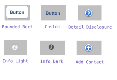
1. 六種外觀類型
UIButtonTypeCustom
UIButtonTypeRoundedRect
UIButtonTypeDetailDisclosure
UIButtonTypeInfoLight
UIButtonTypeInfoDark
UIButtonTypeContactAdd
UIButton *button = [[UIButton alloc] initWithFrame:CGRectMake(10, 10, 100, 44)];
[UIButton buttonWithType:UIButtonTypeCustom];
2. 依狀態設定背景圖
// 正常狀態
[button setBackgroundImage:[UIImage imageNamed:@"normal.png"]
                  forState:UIControlStateNormal];

// 按下/選中狀態
[button setBackgroundImage:[UIImage imageNamed:@"pressed.png"]
                  forState:UIControlStateSelected];
這裡有個常被誤用的點:UIControlStateSelected 是「選中」語義,而「手指按下」的正確狀態是 UIControlStateHighlighted。兩者行為不同,依需求選擇。
3. 可拉伸圖片:替專案瘦身
一張 26×46 的圖,要撐成 100×46 的按鈕,直接放大邊緣會變形。用 resizableImageWithCapInsets 可以只拉伸中間、保留四角:
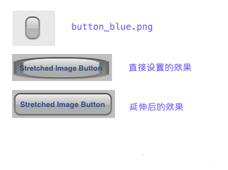
UIImage *buttonNormal = [UIImage imageNamed:@"button-white-part"];

// 四個參數依次是 上、左、下、右 不可拉伸的邊距
// 這裡保留左右各 15/30pt,只拉伸中間
UIImage *stretchNormal = [buttonNormal resizableImageWithCapInsets:
                          UIEdgeInsetsMake(0, 15, 0, 30)];

[button setBackgroundImage:stretchNormal forState:UIControlStateNormal];
QQ 的對話氣泡就是這個原理。好處很直接:一張小圖能對應任意寬度,資源體積大幅下降。
4. 綁定事件
[button addTarget:self
           action:@selector(buttonPress:)
 forControlEvents:UIControlEventTouchUpInside];

- (IBAction)buttonPress:(id)sender
{
    NSLog(@"button pressed!");
}
UIControlEvents 種類繁多,TouchDown、TouchDragInside、TouchUpOutside 等各有用途,需要時查文件即可。
五、在 xib 中添加按鈕
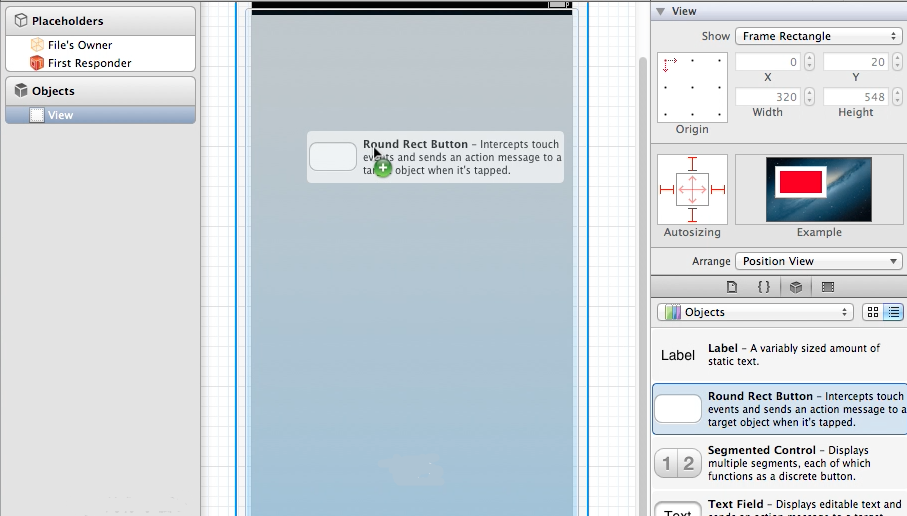
1. 拖入元件
從元件庫把 Button 拖到畫布上。
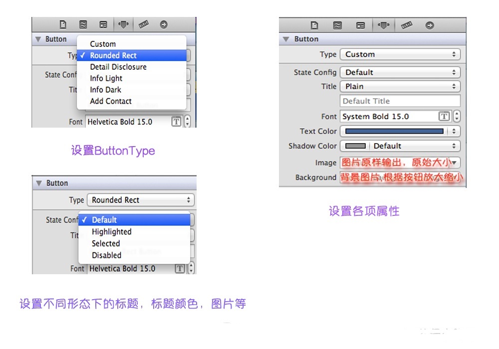
2. 設定屬性
3. 建立關聯與事件
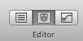
選中 xib,點擊 Xcode 右上方的 Editor 按鈕,讓左側為界面、右側為對應的 .h 檔案。
按住 control 從 button 拖一條線到 .h 中 @interface 與 @end 之間。彈出的對話框裡,Outlet 建立屬性關聯,Action 建立事件方法,填好名稱按 Connect。
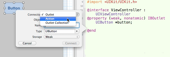
完成後 .m 中會自動生成對應的方法骨架,在裡面寫入邏輯即可。