
React Native 入門:View 組件與常用樣式屬性詳解
前言
- 學習本系列內容需要具備一定的 HTML 與 CSS 基礎。
- 作者接觸 React Native 時間不算特別長,內容如有偏差會及時修正,也歡迎大家批評指正。
- 文章首發於簡書,若出現圖片或排版問題,建議前往簡書查看原文。
JSX 與組件的概念
React 的核心機制之一是虛擬 DOM——在內存中創建 DOM 的虛擬表示,通過批量比對與差量更新來減少對真實 DOM 的操作,從而提升性能。
傳統的原生創建方式如下:
var newBox = document.createElement('div');
newBox.className = 'box';
$('main').appendChild(newBox);
這種寫法可讀性較差,因此 React 提供了 JSX,用我們熟悉的 HTML 語法來描述虛擬 DOM:
<div className="box"></div>需要明確的是,JSX 在打包階段就已經被編譯成純 JavaScript,其語法本身不會帶來額外的性能損耗。因此可以把它理解為一層更直觀的高級語法糖。
View 組件的常見屬性
React Native 的 View 組件作用等同於 iOS 中的 UIView、Android 中的 android.view,或網頁中的 div 標簽。它是所有基礎組件的父容器,其他組件都繼承了它的屬性。下面把常用屬性逐一列出。
backgroundColor:背景顏色
// 背景顏色
backgroundColor: 'red'
效果: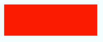
borderBottomColor / borderBottomWidth:底部邊框顏色與寬度
// 底部邊框寬度
borderBottomWidth: 5,
// 底部邊框顏色
borderBottomColor: 'green'
效果: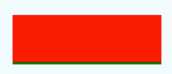
borderBottomLeftRadius:左下角圓角
// 底部邊框左圓角
borderBottomLeftRadius: 5
效果: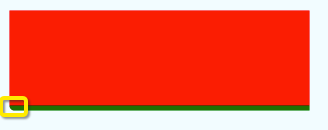
borderBottomRightRadius:右下角圓角
// 底部邊框右圓角
borderBottomRightRadius: 5
效果: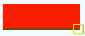
borderBottomWidth:底部邊框寬度
// 底部邊框寬度
borderBottomWidth: 5
效果: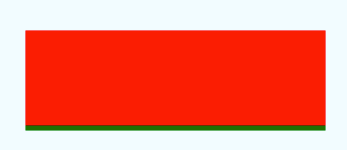
borderColor / borderWidth:整體邊框顏色與寬度
// 全體邊框寬度
borderWidth: 5,
// 全體邊框顏色
borderColor: 'yellow'
效果: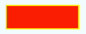
borderLeftColor / borderLeftWidth:左邊框顏色與寬度
// 左邊框顏色
borderLeftColor: 'black'
效果: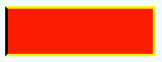
// 左邊框寬度
borderLeftWidth: 10
效果: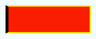
borderRadius:整體圓角
// 全體邊框寬度
borderWidth: 5,
// 全體邊框顏色
borderColor: 'black',
// 全體邊框圓角
borderRadius: 3
效果: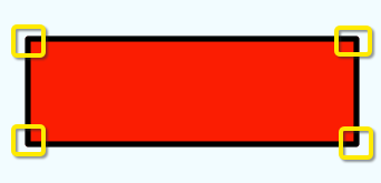
borderRightColor / borderRightWidth:右邊框顏色與寬度
// 右邊框顏色
borderRightColor: 'yellow'
效果: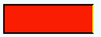
// 右邊框寬度
borderRightWidth: 10
效果: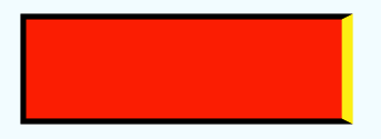
borderStyle:邊框樣式,可選 solid / dotted / dashed
// 邊框風格:實線
borderStyle: 'solid'
效果: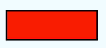
// 邊框風格:點線
borderStyle: 'dotted'
效果: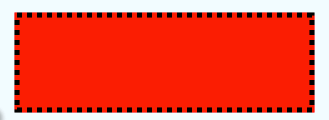
// 邊框風格:虛線
borderStyle: 'dashed'
效果: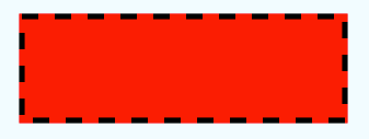
borderTopColor / borderTopWidth / borderTopLeftRadius / borderTopRightRadius
這幾個屬性的用法與前述 bottom、left、right 系列完全對稱,分別控制頂部邊框顏色、頂部邊框寬度、頂部左右圓角。
borderWidth:整體邊框寬度
// 全體邊框寬度
borderWidth: 5
效果: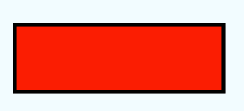
opacity:透明度,取值範圍 0 ~ 1
// 透明度
opacity: 0.5
效果: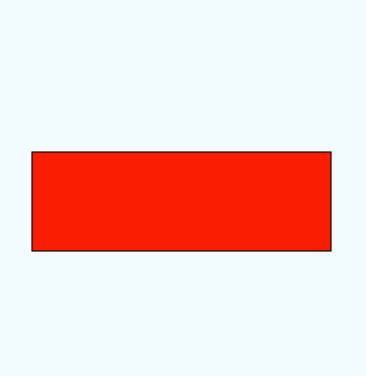
其他屬性
· Flexbox:彈性佈局
· Transforms:變換動畫
· backfaceVisibility('visible' / 'hidden'):界面翻轉時背面是否可見
· overflow('visible' / 'hidden'):內容超出容器部分是否顯示
· elevation:設置 Z 軸高度,可產生立體效果
View 組件的使用
寫法一:直接寫樣式對象
render() {
    return (
        <View style={styles.container}>
            <View style={{width: 300, height: 100, backgroundColor: 'red',
                           borderWidth: 1, borderColor: 'black'}}>
            </View>
        </View>
    );
}
效果:
上面這種寫法看起來很像傳統 CSS。但在實際的 React Native 開發中,官方更推薦使用 StyleSheet 來組織樣式,這樣代碼結構更清晰,也便於後期維護。
寫法二:使用 StyleSheet(推薦)
視圖部分:
var test = React.createClass({
    render() {
        return (
            <View style={styles.container}>
                <View style={styles.viewStyle}></View>
            </View>
        );
    }
});
樣式部分:
var styles = StyleSheet.create({
    container: {
        flex: 1,
        justifyContent: 'center',
        alignItems: 'center',
        backgroundColor: '#F5FCFF',
    },
    viewStyle: {
        // 尺寸
        width: 300,
        height: 100,
        // 背景顏色
        backgroundColor: 'red',
        // 邊框寬度
        borderWidth: 1,
        // 邊框顏色
        borderColor: 'black'
    }
});
小結
View 是開發中接觸頻率最高的組件,靈活運用它能幫助我們更好地結構化代碼,也更方便地實現佈局。加上 Flexbox 的加持,多數常見界面都能用「嵌套 View + 樣式組合」的方式搭建出來。