
用 UICollectionView 打造可拖動排列的 iOS 桌面效果(完整實作)
一款 App 能否被用戶留下,通常取決於兩件事:功能是否真正解決問題,以及界面是否讓人願意多停留幾秒。而支撐界面的,正是那些看似獨立、實則各司其職的 UIKit 控件。
說到列表展示,多數 iOS 開發者第一個想到的應該是 UITableView。它在流式數據呈現上確實稱職——資訊流、聊天記錄、通知中心,這類自上而下(或自下而上)的順序排列,用 UITableView 幾乎是標準答案。但 UITableView 並非萬能:一旦需要同時呈現多列、多行的網格數據,它就顯得有些吃力。當然,硬啃也能做出來,可為什麼要為此寫一堆複雜的 cell 佈局程式碼呢?
這正是 UICollectionView 登場的場合。它帶來的優勢主要有兩點:
1. 內容展示樣式可以高度客製化;
2. 大量數據的管理與複用效率更高。
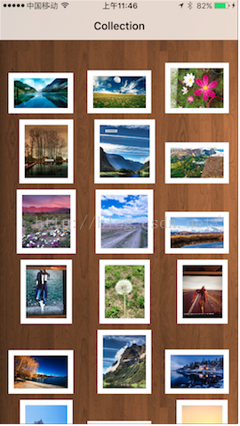
本文就用它做一個「可拖動排序的桌面」:長按任一圖示後即可拖曳到目標位置,其餘圖示自動讓位並平滑重排。
需要實作的協議
使用 UICollectionView 之前,我們的類別至少要實作以下幾個協議:
UICollectionViewDataSource、UICollectionViewDelegateFlowLayout、UICollectionViewDelegate、UIGestureRecognizerDelegate。
UICollectionViewDataSource
它與 UITableView 的 UITableViewDataSource 概念一致,負責提供資料與 cell:
@protocol UICollectionViewDataSource <NSObject>
@required
- (NSInteger)collectionView:(UICollectionView *)collectionView numberOfItemsInSection:(NSInteger)section;
- (UICollectionViewCell *)collectionView:(UICollectionView *)collectionView cellForItemAtIndexPath:(NSIndexPath *)indexPath;

@optional
- (NSInteger)numberOfSectionsInCollectionView:(UICollectionView *)collectionView;
- (UICollectionReusableView *)collectionView:(UICollectionView *)collectionView viewForSupplementaryElementOfKind:(NSString *)kind atIndexPath:(NSIndexPath *)indexPath;
- (BOOL)collectionView:(UICollectionView *)collectionView canMoveItemAtIndexPath:(NSIndexPath *)indexPath NS_AVAILABLE_IOS(9_0);
- (void)collectionView:(UICollectionView *)collectionView moveItemAtIndexPath:(NSIndexPath *)sourceIndexPath toIndexPath:(NSIndexPath*)destinationIndexPath NS_AVAILABLE_IOS(9_0);
@end
UICollectionViewDelegateFlowLayout
UICollectionViewFlowLayout 專門負責管理排版。實作下列方法即可調整間距、尺寸與頁首頁尾:
@protocol UICollectionViewDelegateFlowLayout <UICollectionViewDelegate>
@optional
- (CGSize)collectionView:(UICollectionView *)collectionView layout:(UICollectionViewLayout*)collectionViewLayout sizeForItemAtIndexPath:(NSIndexPath *)indexPath;
- (UIEdgeInsets)collectionView:(UICollectionView *)collectionView layout:(UICollectionViewLayout*)collectionViewLayout insetForSectionAtIndex:(NSInteger)section;
- (CGFloat)collectionView:(UICollectionView *)collectionView layout:(UICollectionViewLayout*)collectionViewLayout minimumLineSpacingForSectionAtIndex:(NSInteger)section;
- (CGFloat)collectionView:(UICollectionView *)collectionView layout:(UICollectionViewLayout*)collectionViewLayout minimumInteritemSpacingForSectionAtIndex:(NSInteger)section;
- (CGSize)collectionView:(UICollectionView *)collectionView layout:(UICollectionViewLayout*)collectionViewLayout referenceSizeForHeaderInSection:(NSInteger)section;
- (CGSize)collectionView:(UICollectionView *)collectionView layout:(UICollectionViewLayout*)collectionViewLayout referenceSizeForFooterInSection:(NSInteger)section;
@end
另外兩個協議相對單純:UICollectionViewDelegate 與 UITableViewDelegate 類似,用來處理選取與高亮;UIGestureRecognizerDelegate 則是為了後續要加入的手勢(拖動)而準備。
初始化:佈局、資料與長按手勢
- (void)viewDidLoad {
    [super viewDidLoad];

    [self.view setBackgroundColor:[UIColor colorWithPatternImage:[UIImage imageNamed:@"back.jpg"]]];

    self.dataSource = [[NSMutableArray alloc] initWithObjects:
        @"1.png",@"2.png",@"3.png",@"4.png",@"5.png",
        @"6.png",@"7.png",@"8.png",@"9.png",@"10.png",
        @"11.jpg",@"12.JPG",@"13.JPG",@"14.jpg",@"15.JPG",
        @"16.png",@"17.png",@"18.png",@"19.png",@"20.png", nil];

    self.flow = [[UICollectionViewFlowLayout alloc] init];
    self.collect = [[UICollectionView alloc] initWithFrame:CGRectZero collectionViewLayout:self.flow];
    [self.collect setBackgroundColor:[UIColor clearColor]];

    // 這一步不可省略
    [self.collect registerClass:[CustomCollectionCell class] forCellWithReuseIdentifier:@"CustomCell"];

    self.collect.delegate = self;
    self.collect.dataSource = self;
    [self.collect setFrame:self.view.bounds];

    self.longPressGestureRecognizer = [[UILongPressGestureRecognizer alloc] init];
    [self.longPressGestureRecognizer addTarget:self action:@selector(handleLongPressRecognizer:)];
    [self.collect addGestureRecognizer:self.longPressGestureRecognizer];

    [self.view addSubview:self.collect];
}
這裡有兩個容易踩到的重點。第一,UICollectionViewFlowLayout 必須與 UICollectionView 搭配使用,兩者相輔相成。第二,與 UITableView 不同,UICollectionView 的 cell 一定要先註冊(registerClass:),否則執行期會直接報錯。
而拖動能力的關鍵,就是替 collectionView 掛上一個 UILongPressGestureRecognizer。長按觸發後交由 handleLongPressRecognizer: 處理:
- (void)handleLongPressRecognizer:(UILongPressGestureRecognizer *)gesture {
    switch (gesture.state) {
        case UIGestureRecognizerStateBegan: {
            NSIndexPath *path = [self.collect indexPathForItemAtPoint:[gesture locationInView:gesture.view]];
            if (path == nil) { break; }
            [self.collect beginInteractiveMovementForItemAtIndexPath:path];
        } break;
        case UIGestureRecognizerStateChanged:
            [self.collect updateInteractiveMovementTargetPosition:[gesture locationInView:gesture.view]];
            break;
        case UIGestureRecognizerStateEnded:
            [self.collect endInteractiveMovement];
            break;
        default:
            [self.collect cancelInteractiveMovement];
            break;
    }
}
邏輯相當直白:手勢開始時取得手指所在的 indexPath 並啟動互動移動;移動中持續更新目標位置;結束時收尾;其餘情況一律取消。系統會自動幫我們處理其他 cell 的讓位動畫。
自訂 Cell:讓圖片依比例呈現
如果每個格子都是正方,畫面看起來就是死板的九宮格。這裡我讓 cell 依圖片本身的長寬比縮放,於是橫圖與直圖交錯,桌面立刻有了層次。
#import "CustomCollectionCell.h"

@implementation CustomCollectionCell

@synthesize imageV = _imageV;
@synthesize labelV = _labelV;
@synthesize boundView = _boundView;

- (id)initWithFrame:(CGRect)frame {
    self = [super initWithFrame:frame];
    if (self) {
        [self setBackgroundColor:[UIColor clearColor]];
        self.imageV = [[UIImageView alloc] initWithFrame:CGRectZero];
        self.labelV = [[UILabel alloc] initWithFrame:CGRectZero];
        self.boundView = [[UIView alloc] initWithFrame:CGRectZero];
        [self.boundView setBackgroundColor:[UIColor whiteColor]];
        [self.boundView addSubview:self.imageV];
        [self addSubview:self.boundView];
        [self addSubview:self.labelV];
    }
    return self;
}

- (void)setImageWithText:(UIImage *)image text:(NSString *)text {
    if (!image) { return; }

    CGFloat imgWidth  = image.size.width;
    CGFloat imgHeight = image.size.height;
    CGFloat iconWidth = 0.0, iconHeight = 0.0;

    if (imgWidth > imgHeight) {
        iconHeight = roundf(((self.frame.size.width - 16) * imgHeight) / imgWidth);
        iconWidth  = self.frame.size.width - 16;
        [self.boundView setFrame:CGRectMake(0, self.frame.size.height - iconHeight - 16, iconWidth + 16, iconHeight + 16)];
        [self.imageV setFrame:CGRectMake(8, 8, iconWidth, iconHeight)];
    } else {
        iconWidth  = roundf(((self.frame.size.width - 16) * imgWidth) / imgHeight);
        iconHeight = self.frame.size.height - 16;
        [self.boundView setFrame:CGRectMake(roundf((self.frame.size.width - iconWidth) / 2), 0, iconWidth + 16, iconHeight + 16)];
        [self.imageV setFrame:CGRectMake(8, 8, iconWidth, iconHeight)];
    }
    [self.imageV setImage:image];
}

@end
資料源與代理:讓拖動真正改動資料
互動移動之所以能「記住」新順序,是因為我們在 moveItemAtIndexPath:toIndexPath: 中同步調整了背後的陣列:
#pragma mark UICollectionViewDataSource

- (NSInteger)collectionView:(UICollectionView *)collectionView numberOfItemsInSection:(NSInteger)section {
    return self.dataSource.count;
}

- (NSInteger)numberOfSectionsInCollectionView:(UICollectionView *)collectionView {
    return 1;
}

- (UICollectionViewCell *)collectionView:(UICollectionView *)collectionView cellForItemAtIndexPath:(NSIndexPath *)indexPath {
    CustomCollectionCell *cell = (CustomCollectionCell *)[collectionView dequeueReusableCellWithReuseIdentifier:@"CustomCell" forIndexPath:indexPath];
    UIImage *image = [UIImage imageNamed:[self.dataSource objectAtIndex:indexPath.row]];
    [cell setImageWithText:image text:@""];
    return cell;
}

- (BOOL)collectionView:(UICollectionView *)collectionView canMoveItemAtIndexPath:(NSIndexPath *)indexPath {
    return YES;
}

- (void)collectionView:(UICollectionView *)collectionView moveItemAtIndexPath:(NSIndexPath *)sourceIndexPath toIndexPath:(NSIndexPath*)destinationIndexPath {
    id item = [self.dataSource objectAtIndex:sourceIndexPath.item];
    [self.dataSource removeObject:item];
    [self.dataSource insertObject:item atIndex:destinationIndexPath.item];
}
點擊的行為則是推入下一個檢視器,把選中的圖片名帶過去:
#pragma mark UICollectionViewDelegate

- (void)collectionView:(UICollectionView *)collectionView didSelectItemAtIndexPath:(NSIndexPath *)indexPath {
    TestViewController *test = [[TestViewController alloc] initWithNibName:@"TestViewController" bundle:nil];
    test.imageName = [self.dataSource objectAtIndex:indexPath.row];
    [self.navigationController pushViewController:test animated:YES];
}

- (BOOL)collectionView:(UICollectionView *)collectionView shouldHighlightItemAtIndexPath:(NSIndexPath *)indexPath {
    return YES;
}
最後是排版參數。固定每格 100×100,四周留 15pt,格間 8pt、行間 10pt:
#pragma mark UICollectionViewDelegateFlowLayout

- (CGSize)collectionView:(UICollectionView *)collectionView layout:(UICollectionViewLayout*)collectionViewLayout sizeForItemAtIndexPath:(NSIndexPath *)indexPath {
    return CGSizeMake(100, 100);
}

// 上左下右
- (UIEdgeInsets)collectionView:(UICollectionView *)collectionView layout:(UICollectionViewLayout*)collectionViewLayout insetForSectionAtIndex:(NSInteger)section {
    return UIEdgeInsetsMake(15, 15, 15, 15);
}

- (CGFloat)collectionView:(UICollectionView *)collectionView layout:(UICollectionViewLayout*)collectionViewLayout minimumInteritemSpacingForSectionAtIndex:(NSInteger)section {
    return 8;
}

- (CGFloat)collectionView:(UICollectionView *)collectionView layout:(UICollectionViewLayout*)collectionViewLayout minimumLineSpacingForSectionAtIndex:(NSInteger)section {
    return 10;
}
以上就是這個 Demo 的核心骨架。UICollectionView 還有許多進階玩法(客製化 Layout、Supplementary View、巢狀結構等)此處未展開,本文更像是餐前的一道開胃菜——把最基礎也最實用的一塊先嚐個味道。