
美圖秀秀美化圖片之邊框 界面設計重大更新
在進行寫邊框前,需要通知大家一聲,整個美化圖片的界面開發已經完全重寫,請大家先下載最新的項目【點擊下載】
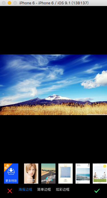
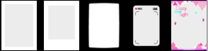
效果圖
在前面的開發方法中由於沒有考慮許多因素,造成viewcontroller代碼混亂,所以重新開發了界面,所有美化圖片的獨立功能都具有一個獨立的viewController,這樣不易混亂。另外學習到了,使用
imageNamed方法時,如果圖片的格式是Z喎?http://www.it165.net/pro/pkqt/" target="_blank" class="keylink">QTke1xL/J0tSyu7zTLnBuZyy1q8rHxuTL+7HIyOdqcGe1xM28xqyx2NDrvNMuanBnuvPXuqGjPC9wPgo8cD7Su6GiwbS90zwvcD4KCjxwcmUgY2xhc3M9"brush:java;"> else if ([text isEqualToString:@"邊框"]) { FWBorderViewController *vc = [[FWBorderViewController alloc] initWithImage:self.image]; [self presentViewController:vc animated:YES completion:^{ }]; }
二、加載界面
1.加載要處理的圖片

 //顯示圖片
    self.imageView = [[UIImageView alloc] initWithImage:self.image];
    self.imageView.frame = CGRectMake(0, 0, WIDTH, HEIGHT - 50 - 70);
    self.imageView.contentMode = UIViewContentModeScaleAspectFit;
    [self.view addSubview:self.imageView];
2.加載保存、取消按鈕


    //保存與取消按鈕的添加
    UIImage *i1 = [UIImage imageNamed:@"btn_cancel_a@2x.png"];
    self.btnClose = [UIButton buttonWithType:UIButtonTypeCustom];
    [self.btnClose setImage:i1 forState:UIControlStateNormal];
    self.btnClose.frame = CGRectMake(20, HEIGHT - kCancelHeight - 10, kCancelHeight, kCancelHeight);
    [self.btnClose addTarget:self action:@selector(btnCancelOrSaveClicked:) forControlEvents:UIControlEventTouchUpInside];
    [self.view addSubview:self.btnClose];

    UIImage *i2 = [UIImage imageNamed:@"btn_ok_a@2x.png"];
    self.btnSave = [UIButton buttonWithType:UIButtonTypeCustom];
    [self.btnSave setImage:i2 forState:UIControlStateNormal];
    self.btnSave.frame = CGRectMake(WIDTH - kCancelHeight - 20, HEIGHT - kCancelHeight - 10, kCancelHeight, kCancelHeight);
    [self.view addSubview:self.btnSave];
    [self.btnSave addTarget:self action:@selector(btnCancelOrSaveClicked:) forControlEvents:UIControlEventTouchUpInside];
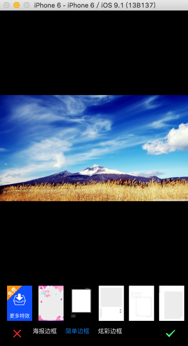
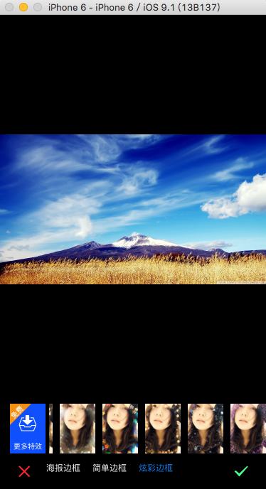
3.加載邊框樣式【海報、簡單、炫彩】bar

    self.styleBar = [[FWEffectBar alloc] initWithFrame:CGRectMake(50, HEIGHT - 40, 200, 20)];
    NSMutableArray *items = [[NSMutableArray alloc] initWithCapacity:0];

    NSArray *titles = [NSArray arrayWithObjects:@"海報邊框", @"簡單邊框", @"炫彩邊框", nil];
    for (int i = 0; i < [titles count]; i ++)
    {
        FWEffectBarItem *item = [[FWEffectBarItem alloc] initWithFrame:CGRectZero];
        item.title = [titles objectAtIndex:i];

        [items addObject:item];
    }

    self.styleBar.items = items;
    self.styleBar.effectBarDelegate = self;
    [self.styleBar setSelectedItem:[self.styleBar.items objectAtIndex:0]];
    [self effectBar:self.styleBar didSelectItemAtIndex:0];
    [self.view addSubview:self.styleBar];
4.加載【更多素材】視圖

FWMoreEffectView *seView = [[FWMoreEffectView alloc] initWithFrame:CGRectMake(15, HEIGHT - 50 - kHeight, kWidth, kHeight)];
    [self.view addSubview:seView];
FWMoreEffectView是一個自定義的視圖,比較簡單,這裡不多介紹。
5.加載具體邊框樣式

    self.borderStyleBar = [[FWEffectBar alloc] initWithFrame:CGRectMake(70, HEIGHT - 50 - kHeight, WIDTH - 70, kHeight)];
    self.borderStyleBar.effectBarDelegate = self;
    self.borderStyleBar.itemBeginX = 15.0;
    self.borderStyleBar.itemWidth = 50.0;
    self.borderStyleBar.margin = 10.0;
  //邊框樣式默認視圖
[self setupPosterBorder];
[self.view addSubview:self.borderStyleBar];
- (void)setupBorderEffect:(NSArray *)images
{
    FWEffectBarItem *item = nil;
    NSMutableArray *items = [[NSMutableArray alloc] initWithCapacity:0];

    for (int i = 0; i < [images count]; i++)
    {
        item = [[FWEffectBarItem alloc] initWithFrame:CGRectMake((kWidth + kSpace) * i + 10, 0, kWidth, kHeight)];
        item.backgroundColor = [UIColor whiteColor];
        UIImage *img1 = [UIImage scaleImage:[UIImage imageNamed:[images objectAtIndex:i]] targetWidth:50];

        [item setFinishedSelectedImage:img1 withFinishedUnselectedImage:img1];
        [items addObject:item];
    }

    self.borderStyleBar.items = items;
}
定義一個加載具體邊框樣式的方法,傳遞一個樣式圖片數組,然後調用下面3個方法實現顯示
//簡單邊框視圖
- (void)setupSimpleBorderView
{
    [self setupBorderEffect:[NSArray arrayWithObjects:@"border_baikuang_a.jpg", @"border_baolilai_a.jpg", @"border_heikuang_a.jpg", @"border_luxiangji_a.jpg", @"border_onenight_a.jpg", @"border_simple_15.jpg", @"border_simple_16.jpg", @"border_simple_17.jpg", @"border_simple_18.jpg", @"border_simple_19.jpg",nil]];
}

//海報邊框視圖
- (void)setupPosterBorder
{
    [self setupBorderEffect:[NSArray arrayWithObjects:@"pb1", @"pb2", @"pb3", @"pb4", @"pb5", @"pb6", @"pb7", @"pb8", @"pb9", @"pb10",nil]];
}

//炫彩邊框視圖
- (void)setupDazzleBorder
{
    [self setupBorderEffect:[NSArray arrayWithObjects:@"xborder_aixin_a.jpg", @"xborder_guangyun_a.jpg", @"xborder_qisehua_a.jpg", @"xborder_wujiaoxing_a.jpg", @"xborder_xueye_a.jpg", @"xborder_yinhe_a.jpg",nil]];
}
我們通過給borderStyleBar不同的items來實現顯示不同的樣式item。
6.實現bar 的委托
#pragma mark - FWEffectBarDelegate
- (void)effectBar:(FWEffectBar *)bar didSelectItemAtIndex:(NSInteger)index
{
    if (bar == self.styleBar)
    {
        switch (index) {
            case 0:
                [self setupPosterBorder];
                break;

            case 1:
                [self setupSimpleBorderView];
                break;

            case 2:
                [self setupDazzleBorder];
                break;
        }
    }
    else
    {
        FWEffectBarItem *item = (FWEffectBarItem *)[bar.items objectAtIndex:index];
        item.ShowBorder = YES;
    }

}
當我們點擊styleBar時,切換邊框樣式類型,當我們點擊borderStyleBar時,應用具體的邊框樣式,且被選中的樣式出現邊框。
隱藏狀態欄
//隱藏狀態欄
- (BOOL)prefersStatusBarHidden
{
    return YES;
}
OVER.THANKS!
- Decosama攝影圖片最新評測:iPhone犀利美圖軟件
- iPhone制圖利器美圖秀秀最新版評測:一款神奇的軟件
- iPhone美圖軟件對比橫評:用戶體驗與功能如何取捨
- iPhone哪個GIF動畫制作軟件好:美圖GIF對比玩圖
- 美圖GIF iPhone版新增泰坦尼克場景
- 美圖貼貼iphone版 女生專屬賣萌神器登App Store
- 邂逅美圖秀秀iPhone新版拍照功能 春攝無邊
- iPhone裡的月光寶盒 美圖GIF帶你體驗時光倒轉
- 騰訊微博如何發美圖私語
- 美圖GIF最新iPhone版(制作真人GIF圖片)
- 升級IOS9系統美圖秀秀變英文了怎麼辦?升級IOS9系統美圖秀秀變英文的解決方法
- 源碼推薦(7.14):生成漂浮氣泡的按鈕,精致唯美圖表
- 源碼推薦(9.02):生成漂浮氣泡的按鈕,精致唯美圖表
- 源碼推薦(10.13):基於UICollectionView的美圖浏覽器,基於XMPP 模仿微信開發的聊天軟件
- iPhone軟件美圖秀秀拼圖視頻教程
