
BadgeValueView:可定位、可自適應寬度的角標組件
編輯:iOS 技巧大全
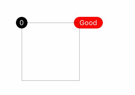
紅點與數字角標幾乎是每個 App 都會用到的元素,但系統並沒有提供現成控件。BadgeValueView 是一個輕量的自定義 UIView,通過一個 badgeValue 字符串驅動,支持六個方位貼合,並能根據文本長度自動伸縮寬度。
實際效果:
源碼地址
完整工程見 GitHub 上的 UI-Component-Collection 倉庫中的 BadgeValueView:
https://github.com/YouXianMing/UI-Component-Collection
頭文件:對外暴露的能力
// BadgeValueView.h
#import <UIKit/UIKit.h>

typedef NS_ENUM(NSUInteger, BadgePosition) {
    BadgePositionCenterLeft,
    BadgePositionCenterRight,
    BadgePositionTopLeft,
    BadgePositionTopRight,
    BadgePositionBottomLeft,
    BadgePositionBottomRight,
};

@interface BadgeValueView : UIView

/** 角標顯示的值 */
@property (nonatomic, strong) NSString *badgeValue;
/** 被附著的目標 view */
@property (nonatomic, weak) UIView *contentView;
/** 文本超出時每次遞增的寬度,默認 4 */
@property (nonatomic) CGFloat sensitiveTextWidth;
/** 敏感增長寬度,默認 10 */
@property (nonatomic) CGFloat sensitiveWidth;
/** 固定高度,默認 20 */
@property (nonatomic) CGFloat fixedHeight;
/** 位置,默認 BadgePositionTopRight */
@property (nonatomic) BadgePosition position;
/** 字體,默認 12 */
@property (nonatomic, strong) UIFont *font;
/** 文字顏色,默認白色 */
@property (nonatomic, strong) UIColor *textColor;
/** 角標底色,默認紅色 */
@property (nonatomic, strong) UIColor *badgeColor;

/** 開始生效(把角標掛到 contentView 上) */
- (void)makeEffect;

/** 設置值並可選擇是否帶動畫 */
- (void)setBadgeValue:(NSString *)value animated:(BOOL)animated;

@end
實現要點
內部只用了一個 UILabel 撐起內容,自身作為圓形背景,通過 cornerRadius = fixedHeight / 2 得到膠囊或圓形外觀。寬度策略是:先讓 label sizeToFit,若文本寬度加上內邊距超過當前寬度就遞增,否則回退到固定高度,從而在「1」和「99+」之間自然伸縮。
// BadgeValueView.m
#import "BadgeValueView.h"
#import "UIView+SetRect.h"

@interface BadgeValueView ()
@property (nonatomic, strong) UILabel *label;
@end

@implementation BadgeValueView

- (instancetype)init {
    if (self = [super init]) {
        self.sensitiveWidth     = 10;
        self.fixedHeight        = 20;
        self.sensitiveTextWidth = 4;
        self.position           = BadgePositionTopRight;
        self.font               = [UIFont systemFontOfSize:12.f];
        self.textColor          = [UIColor whiteColor];
        self.badgeColor         = [UIColor redColor];
    }
    return self;
}

- (void)makeEffect {
    // 內部文本
    self.label = [[UILabel alloc] init];
    self.label.textColor = self.textColor;
    self.label.textAlignment = NSTextAlignmentCenter;
    self.label.font = self.font;
    [self addSubview:self.label];

    // 圓形背景
    self.backgroundColor = self.badgeColor;
    self.width  = self.fixedHeight;
    self.height = self.fixedHeight;
    self.layer.cornerRadius = self.fixedHeight / 2.f;
    self.layer.masksToBounds = YES;

    // 掛載到目標 view 上
    [_contentView addSubview:self];
}

- (void)setBadgeValue:(NSString *)badgeValue animated:(BOOL)animated {
    _badgeValue = badgeValue;

    // 空字符串直接隱藏,可選淡入淡出
    if (animated) {
        [UIView animateWithDuration:0.15f animations:^{
            self.alpha = badgeValue.length == 0 ? 0 : 1;
        }];
    } else {
        self.alpha = badgeValue.length == 0 ? 0 : 1;
    }

    // 值為空則不再往下處理
    if (badgeValue.length <= 0) { return; }

    // 更新文本並自適應尺寸
    self.label.text = badgeValue;
    [self.label sizeToFit];
    if (self.label.width + self.sensitiveTextWidth > self.width) {
        self.width += self.sensitiveWidth;
    } else {
        self.width = self.fixedHeight;
    }
    self.label.center = self.middlePoint;

    // 根據六種方位計算原點
    CGFloat offset = self.fixedHeight / 2.f;
    self.position == BadgePositionCenterLeft  ? self.left = -offset, self.centerY = self.contentView.middleY : 0;
    self.position == BadgePositionCenterRight ? self.left = self.contentView.width - offset, self.centerY = self.contentView.middleY : 0;
    self.position == BadgePositionTopLeft     ? self.left = -offset, self.y = -offset : 0;
    self.position == BadgePositionTopRight    ? self.top = -offset, self.left = self.contentView.width - offset : 0;
    self.position == BadgePositionBottomLeft  ? self.left = -offset, self.top = self.contentView.height - offset : 0;
    self.position == BadgePositionBottomRight ? self.left = self.contentView.width - offset, self.top = self.contentView.height - offset : 0;
}

- (void)setBadgeValue:(NSString *)badgeValue {
    [self setBadgeValue:badgeValue animated:NO];
}

@end
值得留意的是 offset = fixedHeight / 2:因為角標圓心對齊目標 view 的角點,所以無論左上還是右下,都需要向外偏移半個自身高度,視覺上才會「騎」在邊框上而不是縮在內部。
- 上一篇文章: iOS 列表多圖片下載:三級緩存與異步加載的完整實踐
- 下一篇文章: iOS 筆記:NSSet 與 NSArray 的取捨