
Swift 擴充 UIButton:自由調整圖示與文字的位置與間距
UIButton 是 iOS 開發中最常見的控件之一。它預設的排版把圖示固定放在文字左邊,一旦設計稿要求「文字在左、圖示在右」或「圖文上下排列」,就得動手調整。本文先快速盤點 UIButton 的常用 API,再示範如何擴充它來自由擺放圖文。
一、UIButton basics
它採用 Target-Action 設計模式,是 iOS 三種回呼模式之一。底層實作其實就是攔截並回應一連串的觸碰事件:
- (void)touchesBegan:(NSSet *)touches withEvent:(UIEvent *)event;
- (void)touchesMoved:(NSSet *)touches withEvent:(UIEvent *)event;
- (void)touchesEnded:(NSSet *)touches withEvent:(UIEvent *)event;
- (void)touchesCancelled:(NSSet *)touches withEvent:(UIEvent *)event;
建立按鈕用構造器指定樣式:
+ (id)buttonWithType:(UIButtonType)buttonType
常見的 buttonType 有:UIButtonTypeCustom(自訂,最常用)、UIButtonTypeRoundedRect(圓角矩形)、UIButtonTypeDetailDisclosure(藍色小箭頭)、UIButtonTypeInfoLight/Dark(亮暗色資訊鈕)、UIButtonTypeContactAdd(十字加號)、UIButtonTypeSystem(系統預設,使用 setImage 時可能顯示異常)。
UIButton *button = [UIButton buttonWithType:UIButtonTypeRoundedRect];
二、標題相關的設定
titleLabel 是唯讀屬性,請勿直接改它來換文字,正確做法是用 setTitle:forState::
[button setTitle:@"按鈕" forState:UIControlStateNormal];
NSString *title = [button titleForState:UIControlStateNormal];
支援富文本標題:
NSAttributedString *attributedString = [button attributedTitleForState:UIControlStateNormal];
[button setAttributedTitle:attributedString forState:UIControlStateNormal];
顏色與陰影:
[button setTitleColor:[UIColor redColor] forState:UIControlStateNormal];
UIColor *color = [button titleColorForState:UIControlStateNormal];
[button setTitleShadowColor:[UIColor grayColor] forState:UIControlStateNormal];
常用的狀態列舉包括 UIControlStateNormal(一般)、Highlighted(高亮)、Disabled(停用)、Selected(選中)等。
三、圖片與邊距
[button setImage:image forState:UIControlStateNormal];
[button setBackgroundImage:image forState:UIControlStateNormal];

// 內距:內容(圖片+文字)距邊緣的距離
button.contentEdgeInsets = UIEdgeInsetsMake(0, 0, 0, 0);
// 標題距邊緣的距離
button.titleEdgeInsets  = UIEdgeInsetsMake(0, 0, 0, 0);
// 圖片距邊緣的距離
button.imageEdgeInsets  = UIEdgeInsetsMake(0, 0, 0, 0);
其他像是 showsTouchWhenHighlighted(按下發光)、adjustsImageWhenHighlighted(高亮時圖片變暗)也都是常見的細節調整。
四、事件與觸控類型
[button addTarget:self action:@selector(action:) forControlEvents:UIControlEventTouchUpInside];
常用的 UIControlEvent 包含 TouchDown、TouchDownRepeat、TouchDragInside/Outside、TouchDragEnter/Exit、TouchUpInside/Outside、TouchCancel,以及表單相關的 EditingDidBegin、EditingChanged、EditingDidEnd、EditingDidEndOnExit。
五、順手做一個 CheckBox
利用 selected 狀態切換兩張圖,就是最經典的 CheckBox 寫法:
-(void)checkboxClick:(UIButton *)btn
{
    btn.selected = !btn.selected;
}

- (void)viewDidLoad {
    UIButton *checkbox = [UIButton buttonWithType:UIButtonTypeCustom];
    [checkbox setFrame:CGRectMake(135, 150, 36, 36)];
    [checkbox setImage:[UIImage imageNamed:@"checkbox_off.png"] forState:UIControlStateNormal];
    [checkbox setImage:[UIImage imageNamed:@"checkbox_on.png"]  forState:UIControlStateSelected];
    [checkbox addTarget:self action:@selector(checkboxClick:) forControlEvents:UIControlEventTouchUpInside];
    [self.view addSubview:checkbox];
}
六、調整圖文間距:兩種 insets 寫法
使用 Custom 型別的按鈕就能自帶圖示,但相對位置固定是「圖在前、文在後」。要拉開距離,改 insets 即可:
// 建立一個圖片加文字的按鈕
let btn1: UIButton = UIButton(frame: CGRect(x: 50, y: 50, width: 180, height: 32))
btn1.setImage(UIImage(named: "alert"), forState: UIControlState.Normal)
btn1.titleLabel?.font = UIFont.boldSystemFontOfSize(28)
btn1.setTitle("帶圖標按鈕", forState: UIControlState.Normal)
btn1.setTitleColor(UIColor.orangeColor(), forState: UIControlState.Normal)
self.view.addSubview(btn1)
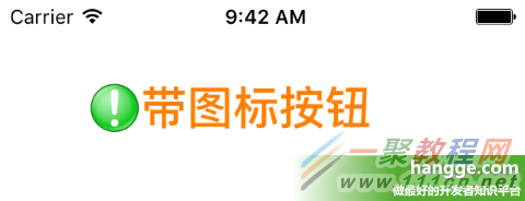
方式一,把圖片往左推(負值表示向左偏移):
btn1.imageEdgeInsets = UIEdgeInsets(top: 0, left: -20, bottom: 0, right: 0)
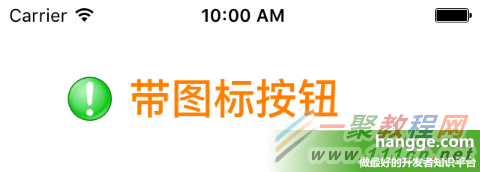
方式二,把文字往右推:
btn1.titleEdgeInsets = UIEdgeInsets(top: 0, left: 20, bottom: 0, right: 0)
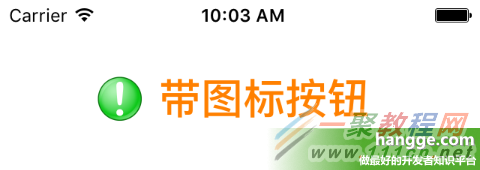
七、擴充 UIButton,一行指定圖文排列
若要「文字在前、圖在後」或「圖文上下排列」,同樣是靠這兩個 insets 變換算出來的,只是數值需要依圖片與文字實際尺寸動態計算。與其在每個地方手算,不如包成一個擴充方法:
import UIKit

extension UIButton {

    @objc func set(image anImage: UIImage?, title: String,
                   titlePosition: UIViewContentMode, additionalSpacing: CGFloat, state: UIControlState) {
        self.imageView?.contentMode = .Center
        self.setImage(anImage, forState: state)

        positionLabelRespectToImage(title, position: titlePosition, spacing: additionalSpacing)

        self.titleLabel?.contentMode = .Center
        self.setTitle(title, forState: state)
    }

    private func positionLabelRespectToImage(title: String, position: UIViewContentMode,
                                             spacing: CGFloat) {
        let imageSize = self.imageRectForContentRect(self.frame)
        let titleFont = self.titleLabel?.font!
        let titleSize = title.sizeWithAttributes([NSFontAttributeName: titleFont!])

        var titleInsets: UIEdgeInsets
        var imageInsets: UIEdgeInsets

        switch (position) {
        case .Top:
            titleInsets = UIEdgeInsets(top: -(imageSize.height + titleSize.height + spacing),
                                       left: -(imageSize.width), bottom: 0, right: 0)
            imageInsets = UIEdgeInsets(top: 0, left: 0, bottom: 0, right: -titleSize.width)
        case .Bottom:
            titleInsets = UIEdgeInsets(top: (imageSize.height + titleSize.height + spacing),
                                       left: -(imageSize.width), bottom: 0, right: 0)
            imageInsets = UIEdgeInsets(top: 0, left: 0, bottom: 0, right: -titleSize.width)
        case .Left:
            titleInsets = UIEdgeInsets(top: 0, left: -(imageSize.width * 2), bottom: 0, right: 0)
            imageInsets = UIEdgeInsets(top: 0, left: 0, bottom: 0,
                                       right: -(titleSize.width * 2 + spacing))
        case .Right:
            titleInsets = UIEdgeInsets(top: 0, left: 0, bottom: 0, right: -spacing)
            imageInsets = UIEdgeInsets(top: 0, left: 0, bottom: 0, right: 0)
        default:
            titleInsets = UIEdgeInsets(top: 0, left: 0, bottom: 0, right: 0)
            imageInsets = UIEdgeInsets(top: 0, left: 0, bottom: 0, right: 0)
        }

        self.titleEdgeInsets = titleInsets
        self.imageEdgeInsets = imageInsets
    }
}
使用範例,四個方向各一個:
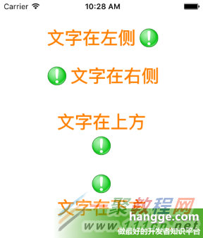
import UIKit

class ViewController: UIViewController {

    override func viewDidLoad() {
        super.viewDidLoad()

        let btn1: UIButton = UIButton(frame: CGRect(x: 0, y: 0, width: 200, height: 32))
        btn1.center = CGPointMake(view.frame.size.width/2, 60)
        btn1.titleLabel?.font = UIFont.boldSystemFontOfSize(28)
        btn1.setTitleColor(UIColor.orangeColor(), forState: UIControlState.Normal)
        btn1.set(image: UIImage(named: "alert"), title: "文字在左側", titlePosition: .Left,
                 additionalSpacing: 10.0, state: .Normal)
        view.addSubview(btn1)

        let btn2: UIButton = UIButton(frame: CGRect(x: 0, y: 0, width: 200, height: 32))
        btn2.center = CGPointMake(view.frame.size.width/2, 120)
        btn2.titleLabel?.font = UIFont.boldSystemFontOfSize(28)
        btn2.setTitleColor(UIColor.orangeColor(), forState: UIControlState.Normal)
        btn2.set(image: UIImage(named: "alert"), title: "文字在右側", titlePosition: .Right,
                 additionalSpacing: 10.0, state: .Normal)
        view.addSubview(btn2)

        let btn3: UIButton = UIButton(frame: CGRect(x: 0, y: 0, width: 170, height: 70))
        btn3.center = CGPointMake(view.frame.size.width/2, 230)
        btn3.titleLabel?.font = UIFont.boldSystemFontOfSize(28)
        btn3.setTitleColor(UIColor.orangeColor(), forState: UIControlState.Normal)
        btn3.set(image: UIImage(named: "alert"), title: "文字在上方", titlePosition: .Top,
                 additionalSpacing: 10.0, state: .Normal)
        view.addSubview(btn3)

        let btn4: UIButton = UIButton(frame: CGRect(x: 0, y: 0, width: 170, height: 70))
        btn4.center = CGPointMake(view.frame.size.width/2, 290)
        btn4.titleLabel?.font = UIFont.boldSystemFontOfSize(28)
        btn4.setTitleColor(UIColor.orangeColor(), forState: UIControlState.Normal)
        btn4.set(image: UIImage(named: "alert"), title: "文字在下方", titlePosition: .Bottom,
                 additionalSpacing: 10.0, state: .Normal)
        view.addSubview(btn4)
    }

    override func didReceiveMemoryWarning() {
        super.didReceiveMemoryWarning()
    }
}
新版 iOS 的替代做法
這套 insets 計算在 iOS 15 之後有了更省力的官方方案:UIButton.Configuration。透過 imagePlacement(.leading/.trailing/.top/.bottom)與 imagePadding 兩個屬性,就能達到完全相同的效果,不必再手算位移;設定時記得改用 configurationUpdateHandler 或 setNeedsUpdateConfiguration() 觸發更新。若專案仍要支援舊版系統,上面的擴充寫法依然是可行且好用的方案。