
cocos2d 進度條實作:CCProgressNode 的三種呈現方式
編輯:iOS 開發綜合
最終效果圖:
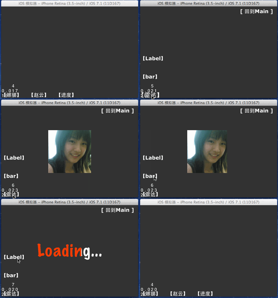
cocos2d 中的 CCProgressNode 就是進度條節點。它的運作方式很特別:並不是自己畫一個長條,而是依附一個 Sprite(精靈)並逐段揭露它,因此你可以用圖片、甚至文字標籤來當進度的載體。
基本觀念
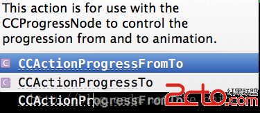
- 建構
CCProgressNode時必須傳入一個 Sprite。 - 可以掛上
CCActionProgressFromTo動作讓進度自動遞增。 - 也可以在
update方法中手動改寫percentage。
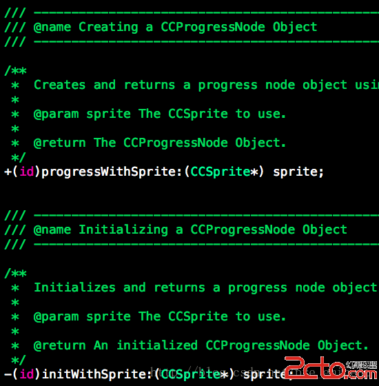
建構方式:
_progressNode = [CCProgressNode progressWithSprite:_sprite];
兩種類型
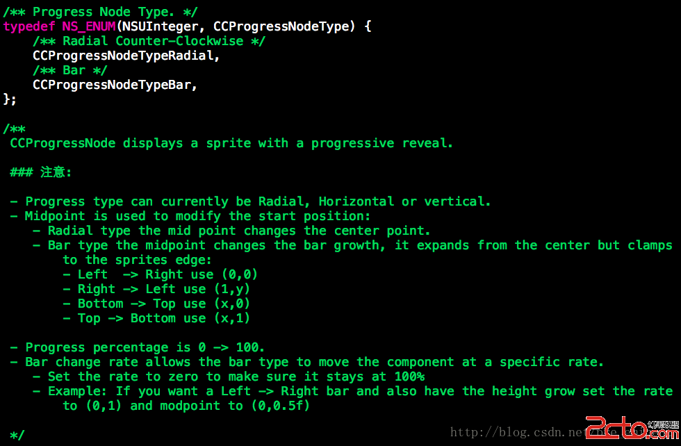
CCProgressNodeTypeRadial——雷達/放射狀,以圓心為中心向外擴展CCProgressNodeTypeBar——條形,沿指定方向逐格填滿
場景程式碼
標頭檔:
#import "CCScene.h"
#import "cocos2d.h"
#import "cocos2d-ui.h"

@interface ProgressScene : CCScene

+ (instancetype)scene;
- (id)init;

@end
實作檔:
#import "ProgressScene.h"

@interface ProgressScene ()
{
    CCSprite       *_sprite;       // 進度的載體精靈
    CCProgressNode *_progressNode; // 進度條本體
}
@end

@implementation ProgressScene

#pragma mark - 生命週期

+ (instancetype)scene
{
    return [[self alloc] init];
}

- (id)init
{
    self = [super init];
    if (!self) return nil;

    [self setupBgColor];                // 深灰背景
    [self addBackToMainBtnOnRightTop];  // 右上角返回鈕
    [self addShowBtns];                 // 三個演示按鈕

    return self;
}

#pragma mark - 建立演示按鈕

- (void)addShowBtns
{
    // 1. 精靈本身不加入場景,只作為進度的遮罩來源
    _sprite = [CCSprite spriteWithImageNamed:@"nanaLogo.jpg"];
    _sprite.name = @"nana";

    // 2. 以精靈建構進度節點
    _progressNode = [CCProgressNode progressWithSprite:_sprite];
    _progressNode.position = ccp(self.contentSize.width * 0.5,
                                 self.contentSize.height / 2);

    // 3. 三種效果的切換按鈕
    [self addBtn:@"【雷達】" position:ccp(0, 0.0) target:self sel:@selector(radarBtnClick)];
    [self addBtn:@"【bar】"  position:ccp(0, 0.2) target:self sel:@selector(barBtnClick)];
    [self addBtn:@"【Label】" position:ccp(0, 0.4) target:self sel:@selector(labelBtnClick)];
}

#pragma mark - 雷達型進度條

- (void)radarBtnClick
{
    [_progressNode removeFromParent];

    _progressNode.type       = CCProgressNodeTypeRadial;
    _progressNode.percentage = 0;              // 0 ~ 100,0 表示完全不顯示
    _progressNode.midpoint   = ccp(0.5, 0.5);  // 圓心位置,類似錨點

    [self addChild:_progressNode];

    // 也可以用動作驅動:
    // CCActionProgressFromTo *action = [CCActionProgressFromTo actionWithDuration:1 from:0 to:100];
    // [_progressNode runAction:action];
}

#pragma mark - 條形進度條

- (void)barBtnClick
{
    [_progressNode removeFromParent];

    _progressNode.type       = CCProgressNodeTypeBar;
    _progressNode.percentage = 0;
    _progressNode.midpoint   = ccp(0.0, 0.0);   // 從左下角開始填
    // 仅在 bar 模式下有效:只讓 X 方向增加,Y 方向不變
    _progressNode.barChangeRate = ccp(1.0, 0.0);

    // 註意:barChangeRate 的 y 為 0 時,midpoint 的 y 值可任意填寫

    [self addChild:_progressNode];
}

#pragma mark - 文字型進度條

- (void)labelBtnClick
{
    [_progressNode removeFromParent];

    // 1. 先放一個白色底字
    CCLabelTTF *bgWhiteLabel =
        [CCLabelTTF labelWithString:@"Loading..." fontName:@"Marker Felt" fontSize:60];
    bgWhiteLabel.position = ccp(self.contentSize.width * 0.5,
                                self.contentSize.height / 2);
    [self addChild:bgWhiteLabel];

    // 2. 再疊一個紅色的,初始 percentage 為 0 所以看不見
    CCLabelTTF *redLabel =
        [CCLabelTTF labelWithString:@"Loading..." fontName:@"Marker Felt" fontSize:60];
    redLabel.color = [CCColor colorWithCcColor3b:ccc3(255, 0, 0)];

    _progressNode = [CCProgressNode progressWithSprite:redLabel];
    _progressNode.position      = bgWhiteLabel.position;
    _progressNode.type          = CCProgressNodeTypeBar;
    _progressNode.percentage    = 0;
    _progressNode.midpoint      = ccp(0.0, 0.0);
    _progressNode.barChangeRate = ccp(1.0, 0.0);

    [self addChild:_progressNode];
}

#pragma mark - 用 update 驅動進度

// cocos2d v3 中,只要實作 update 就會被自動呼叫
- (void)update:(CCTime)delta
{
    _progressNode.percentage++;
}

#pragma mark - 工具方法

- (void)addBtn:(NSString *)title
      position:(CGPoint)position
        target:(id)target
           sel:(SEL)sel
{
    CCButton *btn = [CCButton buttonWithTitle:title
                                    fontName:@"Verdana-Bold"
                                    fontSize:18.0f];
    btn.positionType = CCPositionTypeNormalized;
    // 這裡是笛卡兒座標系,原點在左下方
    btn.position   = position;
    btn.anchorPoint = ccp(0, 0);

    [btn setTarget:target selector:sel];
    [self addChild:btn];
}

- (void)addBackToMainBtnOnRightTop
{
    CCButton *backButton = [CCButton buttonWithTitle:@"[ 回到Main ]"
                                            fontName:@"Verdana-Bold"
                                            fontSize:18.0f];
    backButton.positionType = CCPositionTypeNormalized;
    backButton.position     = ccp(0.85f, 0.95f); // 螢幕右上
    [backButton setTarget:self selector:@selector(backToMainBtnClicked)];
    [self addChild:backButton];
}

- (void)backToMainBtnClicked
{
    [[CCDirector sharedDirector] replaceScene:[NSClassFromString(@"MainScene") scene]
                               withTransition:[CCTransition transitionPushWithDirection:
                                               CCTransitionDirectionRight duration:1.0f]];
}

- (void)setupBgColor
{
    CCNodeColor *background =
        [CCNodeColor nodeWithColor:[CCColor colorWithRed:0.2f green:0.2f blue:0.2f alpha:1.0f]];
    [self addChild:background];
}

@end
幾個容易搞混的屬性
- midpoint:起始基準點,雷達模式下是圓心,bar 模式下決定從哪一端開始填。
- barChangeRate:只在 bar 模式生效,控制哪個軸向會隨進度改變。
ccp(1, 0)是水平增長,ccp(0, 1)則是垂直增長。 - percentage:範圍 0~100,超出範圍的值行為未定義,記得夾住邊界。
由於 CCProgressNode 本質是「遮罩 + 內容」,只要你能把它做成 Sprite,就能拿來當進度條——這正是它比自繪長條靈活的地方。 loading 文字漸變、圖片逐步揭露、雷達掃描動畫,都是同一個 API 的不同用法。