
iOS 開發:UITableViewCell 的四種內建樣式類型
編輯:iOS 開發綜合
UITableViewCell 提供了四種內建的樣式(Style),分別適用於不同的版面需求。透過 initWithStyle:reuseIdentifier: 初始化時指定樣式,即可呈現不同的文字與圖片佈局。以下用一個實際例子展示這四種類型的差異。
- (UITableViewCell *)tableView:(UITableView *)tableView cellForRowAtIndexPath:(NSIndexPath *)indexPath {
    UITableViewCell *cell;
    switch (indexPath.row) {
        case 0: {
            // 預設樣式:只有 textLabel
            cell = [[UITableViewCell alloc] initWithStyle:UITableViewCellStyleDefault reuseIdentifier:@"CELL1"];
            cell.backgroundColor = [UIColor yellowColor];
            cell.selectionStyle = UITableViewCellSelectionStyleDefault;
        } break;
        case 1: {
            // Subtitle 樣式:textLabel + detailTextLabel(上下排列)
            cell = [[UITableViewCell alloc] initWithStyle:UITableViewCellStyleSubtitle reuseIdentifier:@"CELL2"];
            cell.backgroundColor = [UIColor redColor];
            cell.selectionStyle = UITableViewCellSelectionStyleGray;
        } break;
        case 2: {
            // Value1 樣式:detailTextLabel 顯示在右側
            cell = [[UITableViewCell alloc] initWithStyle:UITableViewCellStyleValue1 reuseIdentifier:@"CELL3"];
            cell.backgroundColor = [UIColor blueColor];
            cell.selectionStyle = UITableViewCellSelectionStyleBlue;
        } break;
        case 3: {
            // Value2 樣式:detailTextLabel 在左側灰底
            cell = [[UITableViewCell alloc] initWithStyle:UITableViewCellStyleValue2 reuseIdentifier:@"CELL4"];
            cell.backgroundColor = [UIColor purpleColor];
            cell.selectionStyle = UITableViewCellSelectionStyleDefault;
        } break;
    }
    cell.imageView.image = [UIImage imageNamed:@"warning_btn"];
    cell.detailTextLabel.text = @"detailTextLabel";
    cell.textLabel.text = @"textLabel";
    return cell;
}
運行效果如下:
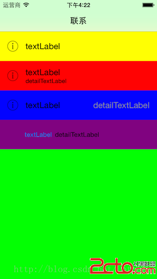
四種樣式各有側重:Default 最簡單,只顯示主標題;Subtitle 適合需要主副標題的場景;Value1 把次要資訊靠右對齊;Value2 則將次要資訊以灰底顯示於左側。選對樣式能省去大量手動佈局的功夫。