
iOS 開發:基本 UI 控件詳解(UISegmentedControl、UIImageView、UIProgressView、UISlider、UIAlertView 等)
一、分段控件(UISegmentedControl)
控件展示:

1. UISegmentedControl 控件屬性
(1) Style 屬性
Style 屬性:

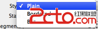
-- Plain:分段控件使用最普通的風格;
-- Bordered:在最普通風格上添加一圈邊框;
-- Bar:分段控件使用工具列風格;
(2) State 屬性
State 屬性:

-- Momentary 復選框:勾選後,分段控件不保存控件狀態,點擊時高亮,點擊後恢復原樣;
(3) Tint 屬性
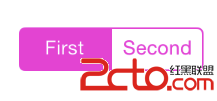
Tint 屬性:

-- 作用:設定分段控件被選中的高亮顏色;
-- 效果展示:
(4) Segments 屬性
Segments 屬性:

-- 作用:控制分成幾段;
-- 展示效果:

(5) Segment 屬性
Segment 屬性:

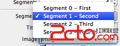
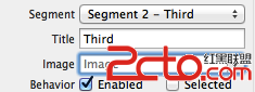
-- 作用:為不同的分段設定對應的標題、圖片等內容;
(6) Title 屬性
Title 屬性:每個 Segment 都有一個 Title 屬性,就是分段按鈕每個按鈕的標題;
(7) Image 屬性
Image 屬性:為不同的分段 Segment 設定圖片;
(8) Behavior 屬性
Behavior 屬性:
-- Enable 復選框:用於設定 Segment 是否可用;
-- Selected 復選框:用於設定 Segment 是否被選中;
2. 使用 UISegmentedControl 改變背景顏色
透過 selectedSegmentIndex 取得當前選中的索引,再用 switch 針對不同索引切換背景顏色,即可實現分段切換切換背景的效果。以下為點擊響應方法示例:
- (IBAction)segmentControl:(id)sender { int index = [sender selectedSegmentIndex]; switch (index) { case 0: self.baseView.backgroundColor = [UIColor whiteColor]; break; case 1: self.baseView.backgroundColor = [UIColor blackColor]; break; case 2: self.view.backgroundColor = [UIColor greenColor]; break; case 3: self.view.backgroundColor = [UIColor blueColor]; break; default: break; } }
3. 動態增加刪除分段
主要 API:
-- 插入分段:呼叫 segmentControl 的 insertSegmentWithTitle:atIndex:animated: 方法,參數一為標題,參數二為插入索引;
[self.segmentControl insertSegmentWithTitle:tittle atIndex:count animated:YES];
-- 刪除分段:只需注明索引值即可;
[self.segmentControl removeSegmentAtIndex:count - 1 animated:YES];
二、圖像控件(UIImageView)
1. UIImageView 控件屬性
UIImageView 繼承自 UIView,無法響應用戶操作,屬於靜態控件。其常用屬性與方法包括:
-- image(普通):存取或設定該控件顯示的圖片;HighlightedImage(高亮):設定圖片處於高亮狀態時顯示的圖片。
-- 動畫相關:animationImages(多張動畫圖)、animationDuration(動畫持續時間)、animationRepeatCount(重複次數)、startAnimating(開始播放)、stopAnimating(停止播放)、isAnimating(是否正在播放)。
-- 縮放屬性(contentMode):Scale To Fill(不保持縱橫比,完全自適應)、Aspect Fit(保持縱橫比,完整顯示長邊)、Aspect Fill(保持縱橫比,短邊完整)、Center/Top/Bottom/Left/Right 等(不縮放,顯示指定區域)。
2. 圖片瀏覽器示例要點
透過 UITapGestureRecognizer 手勢識別器,配合 CGImageCreateWithImageInRect 擷取觸摸位置附近的圖像區域,即可實現「點擊大圖擷取局部顯示於小圖」的效果。關鍵步驟如下:
//設置大圖片可以相應手勢點擊 self.bigPicture.userInteractionEnabled = YES; UITapGestureRecognizer * tap = [[UITapGestureRecognizer alloc] initWithTarget:self action:@selector(click:)]; [self.bigPicture addGestureRecognizer:tap];
在 click: 方法中,取得手指觸摸位置、原圖的 CGImageRef,計算縮放比例後用 CGImageCreateWithImageInRect 擷取局部,最後以 [UIImage imageWithCGImage:] 生成新圖並賦給小圖控件。
3. 幻燈片放映
將 UIImage 陣列賦給 imageView.animationImages,設定 animationDuration 與 animationRepeatCount 後呼叫 startAnimating,即可實現幻燈片自動輪播。
images = [NSArray arrayWithObjects: [UIImage imageNamed:@"1.png"], [UIImage imageNamed:@"2.jpg"], [UIImage imageNamed:@"3.png"], nil]; self.imageView.animationImages = images; self.imageView.animationDuration = 5; self.imageView.animationRepeatCount = 0xFFFF; [self.imageView startAnimating];
三、進度條控件(UIProgressView)
1. UIProgressView 控件屬性
-- Style 屬性:Default(默認風格)、Bar(工具列風格);
-- progress 屬性:設定已完成進度的比例值,取值範圍 0.0 ~ 1.0;
-- Progress Tint 屬性:已完成部分的顏色;Track Tint 屬性:進度條軌道顏色;
-- progressImage 屬性:設定進度條已完成部分的圖片(Interface Builder 中未體現);trackImage 屬性:設定進度條軌道圖片(需在程式碼中設定)。
2. 可拉伸圖片
為 UIProgressView 設定的 progressImage 與 trackImage 必須是可拉伸圖片。可透過 resizableImageWithCapInsets:resizingMode: 建立,並以 UIEdgeInsets 結構體(含 left、top、right、bottom 四個值)定義拉伸區域——圖片僅在這四個邊緣區域縮放,中心部分保持不變。
UIImage * trackImage = [[UIImage imageNamed:@"Snip20151210_139.png"] resizableImageWithCapInsets:UIEdgeInsetsZero resizingMode:UIImageResizingModeTile]; self.progress3.progressImage = progressImage; self.progress3.trackImage = trackImage;
搭配 NSTimer 定時器,即可讓進度條隨時間遞增動起來:
timer = [NSTimer scheduledTimerWithTimeInterval:0.1 target:self selector:@selector(doProgress) userInfo:nil repeats:YES];
四、進度環控件(UIActivityIndicatorView)
-- Style 屬性:Large White(大的白色風格)、White(白色風格)、Gray(灰色風格);
-- Color 屬性:設定進度環的顏色,會覆蓋風格本身的顏色;
-- Behavior 屬性:Animating(顯示出來後立即轉動)、Hides When Stopped(停止時自動隱藏);
-- 大小:標準風格為 20×20,大風格為 37×37;
-- 控制方法:startAnimating(開始轉動)、stopAnimating(停止轉動)。
可透過 IBOutletCollection 將多個 UIActivityIndicatorView 收集到一個陣列中,再用迴圈統一控制它們的開始與停止動畫。
五、拖動條控件(UISlider)
拖動條改變透明度示例:透過 valueChange: 事件讀取 slid.value(範圍 0~1),再將其賦給圖片的 alpha,即可用滑桿動態調整圖片透明度。
- (IBAction)valueChange:(id)sender { [self.image setAlpha: self.slid.value]; }
UISlider 還可透過 setMinimumTrackImage:forState:、setMaximumTrackImage:forState:、setThumbImage:forState: 分別自訂已完成軌道、未完成軌道與滑塊的圖片。
六、警告框控件(UIAlertView)
建立流程:建立 UIAlertView(指定標題、內容、按鈕等)→ 呼叫 show 顯示 → 為委託對象實作 UIAlertViewDelegate 協定中的方法來監聽按鈕點擊。常用協定方法如 alertView:clickedButtonAtIndex:(點擊按鈕時激發,buttonIndex 為按鈕索引)、willPresentAlertView:、didPresentAlertView: 等。
透過 alertViewStyle 屬性可設定輸入框風格:UIAlertViewStyleDefault(默認)、UIAlertViewStyleSecureTextInput(密碼輸入框)、UIAlertViewStylePlainTextInput(普通輸入框)、UIAlertViewStyleLoginAndPasswordInput(帳號密碼輸入),再用 textFieldAtIndex: 取得對應的輸入框。
UIAlertView * alert = [[UIAlertView alloc] initWithTitle:@"對話框標題" message:@"對話框內容" delegate:self cancelButtonTitle:@"取消顯示" otherButtonTitles:@"按鈕1", @"按鈕2", nil]; [alert show];
七、UIActionSheet 控件
UIActionSheet 是顯示在界面底部的按鈕列表,包含一個標題與多個按鈕。其中「取消按鈕」為灰色背景,「銷毀按鈕」為紅色背景。支援的風格有 UIActionSheetStyleDefault、UIActionSheetStyleBlackTranslucent、UIActionSheetStyleBlackOpaque。同樣透過 UIActionSheetDelegate 的 actionSheet:clickedButtonAtIndex: 方法監聽按鈕點擊。
UIActionSheet * actionSheet = [[UIActionSheet alloc] initWithTitle:@"是否刪除" delegate:self cancelButtonTitle:@"取消" destructiveButtonTitle:@"確定" otherButtonTitles: @"按鈕一", @"按鈕二", nil]; actionSheet.actionSheetStyle = UIActionSheetStyleAutomatic; [actionSheet showInView:self.view];
- 上一篇文章: iOS 開發:使用 delegate 進行訊息傳遞
- 下一篇文章: iOS HLS 串流切片實戰:影片只有聲音、沒有畫面的排查思路