
Auto Layout 實戰心得(全五篇):從第一條約束到自適應 Cell 高度
本系列以一個邊摸索邊記錄的新手視角,帶你走完 Auto Layout 的學習曲線,目標是讀完之後能自己動手完成絕大多數常見的佈局約束。系列程式碼倉庫:https://github.com/johnlui/AutoLayout ,搭配閱讀效果最好。
一、初體驗
背景
Auto Layout 是蘋果在 Xcode 5(iOS 6)導入的佈局方式,最初是為了解決 3.5 吋與 4 吋螢幕的適配問題。iPhone 6 與 Plus 發表後,多尺寸適配的重要性再上一層,過去那套「寫死座標」的笨辦法制程工時暴增,於是越來越多人開始認真學 Auto Layout。
本文的開發環境為 OS X 10.10.2 與 Xcode 6.2 (6C131e)。
動手做一個按鈕
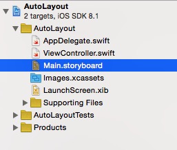
新建 Single View Application,命名為 AutoLayout,打開 Main.storyboard。
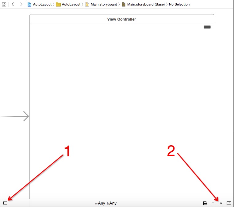
畫面右上那兩顆按鈕在後續章節會反覆用到,這裡先約定稱為「按鈕1」與「按鈕2」,請記住它們的位置。
學習新技術時,我偏好設定一個具體的目標——例如真的要做給客戶用的功能,而不是「為了學新技術」這種空泛理由。這次我們要做的,是一顆左右留白、高度固定、垂直居中的按鈕,文字寫「Swift on iOS」。
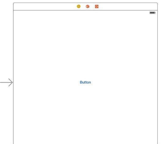
先從元件庫拖一顆按鈕到畫面正中央,這一步會有參考線輔助。
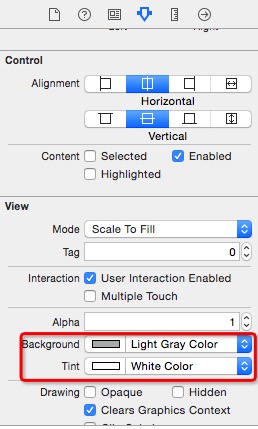
接著調整按鈕的背景色與前景色。
把按鈕的左右邊界分別往外拖到自動吸附的位置,各留出一段距離。
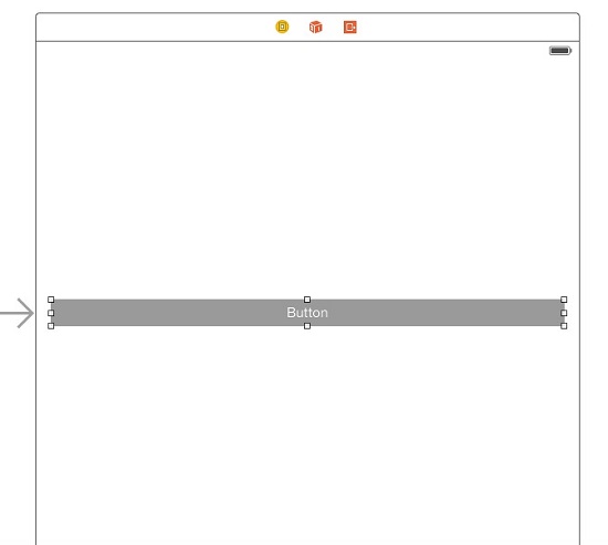
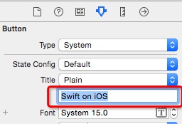
把文字改成 Swift on iOS。
選中按鈕,點擊「按鈕2」並選擇對應項目。
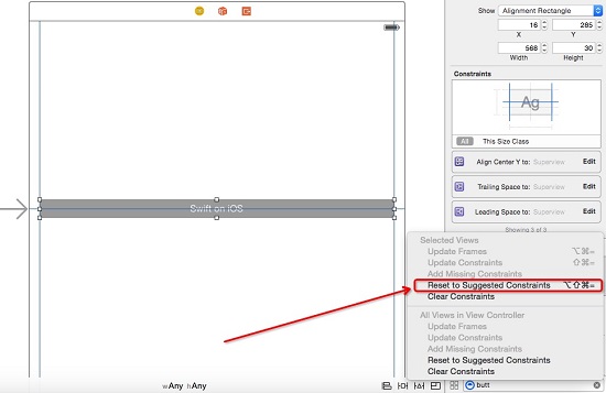
此時按鈕周圍會浮現幾條藍線,那就是 Auto Layout 產生的約束。
驗證成果
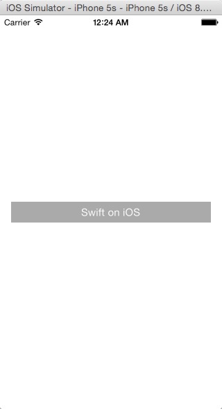
3.5 吋:
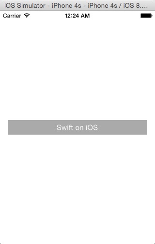
4 吋:
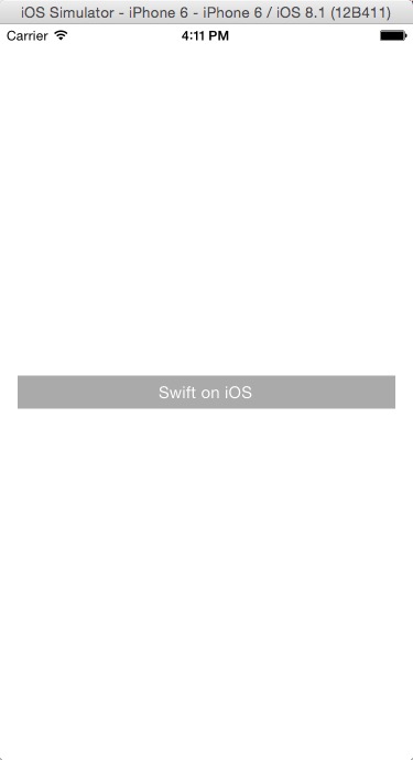
4.7 吋:
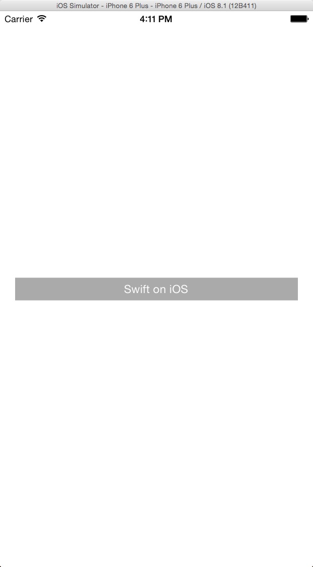
5.5 吋:
選中按鈕,右側可以看到自動產生的約束只有三項。
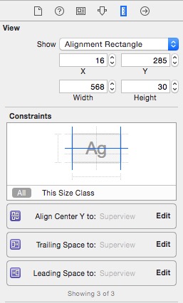
它們的意思分別是:與父視圖垂直居中、右側對齊父視圖、左側對齊父視圖。這三項足以定位水平位置,卻少了描述高度的那一項——這是後續章節要補上的關鍵。
核心思想:嚴格約束
Auto Layout 的本質,是用一組約束條件把元素釘在唯一位置上。你可以只用一條約束來解決小問題(例如防止內容溢出),但實務上最省力的做法,是把畫面上每個元素都「嚴格約束」到底。
所謂嚴格約束,不是把座標寫死,而是給元素一組在任何螢幕尺寸下都成立的完整條件。用直角座標系想就很清楚:要描述一個矩形,只需要「到左邊界的距離、到上邊界的距離、寬、高」這四個值。
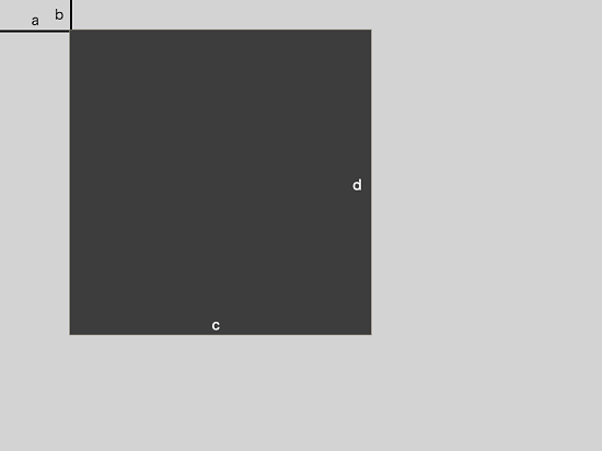
這是最簡單的情形。做嚴格約束時,請在腦中把元素加上幾條條件,如果它既不能縮放也不能移動,那就成功了。請牢記一句話:對畫面上每個元素都做嚴格約束,不嚴格的約束是萬惡之源。
二、用約束實現三等分
約束大致可分為四類:相對於父 view 的間距、相對於前一個元素的間距、對齊類約束(與父 view 或兄弟元素對齊),以及相等約束(例如與父 view 等寬)。
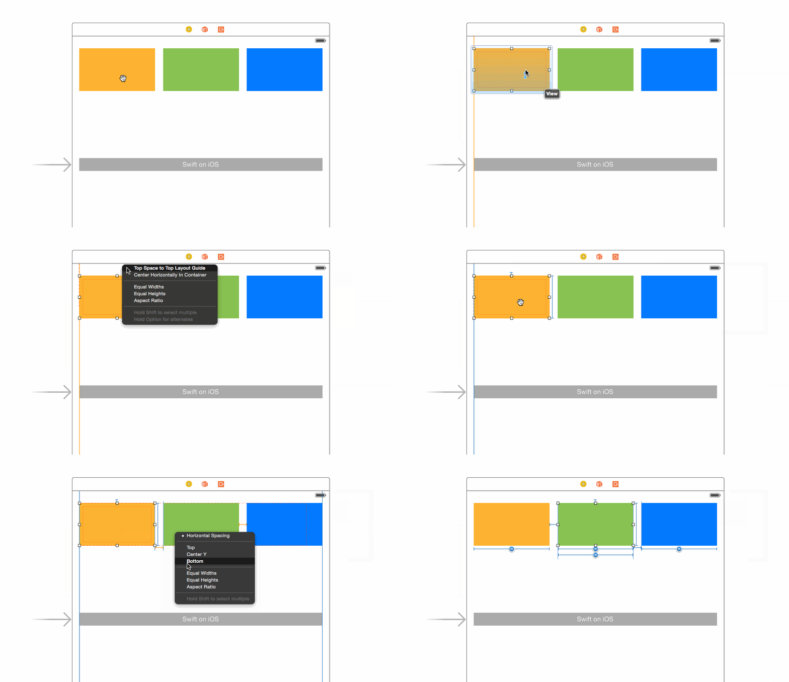
很多人以為 Auto Layout 只能做前一兩類,其實後兩類才是它真正強大的地方。橫向三等分的設計思路是:
- 第一個元素距左邊固定距離
- 最後一個元素距右邊固定距離
- 三者高度固定、寬度相等
- 1 與 2、2 與 3 之間的橫向間距固定
操作動圖如下。
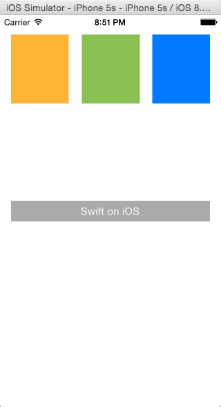
4 吋下的執行結果:
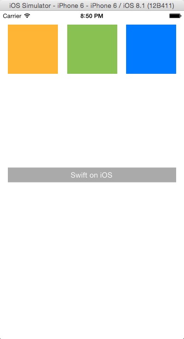
4.7 吋下的執行結果:
縱向三等分的做法完全同理,有興趣可以自己試試。
三、自訂 cell 並套用 Auto Layout
StoryBoard 可以視為一堆 xib 的集合,這意味著兩件事:App 透過主 StoryBoard 啟動,而 UIViewController 由 StoryBoard 綁定後初始化;同時我們也能建立新的 StoryBoard 或 xib 來組裝 UI,再動態載入頁面。
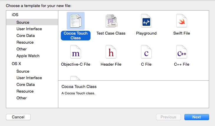
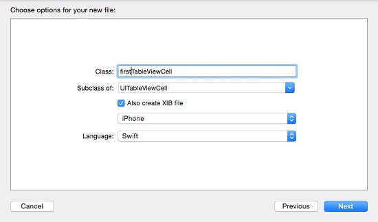
新增 Cocoa Touch Class,勾選同時建立 xib。
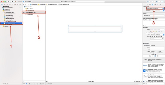
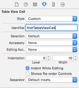
分別選中上圖的 1、2 兩處,確認 3 處是否已自動綁定為 firstTableViewCell;若沒有,先確認選取的確實是合適的物件,再手動綁定即可。接著切到 Identity 頁籤,設定 reuse identifier。
新增一個 Table View Controller 頁面,並把先前那顆「Swift on iOS」按鈕的點擊事件綁定過去。
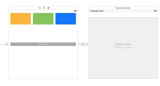
建立名為 firstTableViewController 的 UITableViewController 類別(不需要 xib),然後在 StoryBoard 中選取該控制器,於右側與類別完成綁定。
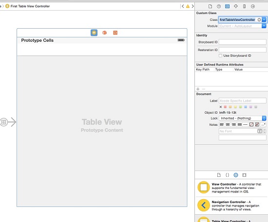
接著在 firstTableViewController 中載入自訂 cell:
import UIKit

class firstTableViewController: UITableViewController {
    override func viewDidLoad() {
        super.viewDidLoad()
        let nib = UINib(nibName: "firstTableViewCell", bundle: nil)
        self.tableView.registerNib(nib, forCellReuseIdentifier: "firstTableViewCell")
    }

    override func numberOfSectionsInTableView(tableView: UITableView) -> Int {
        return 1
    }

    override func tableView(tableView: UITableView, numberOfRowsInSection section: Int) -> Int {
        return 10
    }

    override func tableView(tableView: UITableView, cellForRowAtIndexPath indexPath: NSIndexPath) -> UITableViewCell {
        let cell = tableView.dequeueReusableCellWithIdentifier("firstTableViewCell", forIndexPath: indexPath) as! firstTableViewCell
        cell.textLabel?.text = indexPath.row.description
        return cell
    }
}
viewDidLoad 中的兩行負責載入 xib;底下三個方法分別定義 section 數量、每個 section 的列數,以及每一列的實例化與內容填充。
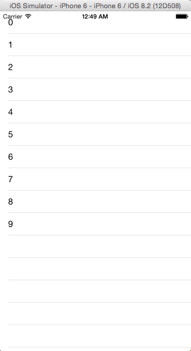
看到上面的畫面,就代表自訂 cell 已經成功被呼叫。
往 Images.xcassets 裡隨意加一張圖片,然後在 firstTableViewCell.xib 中拖入一個 Image View,並在右側設定尺寸。
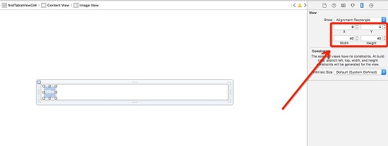
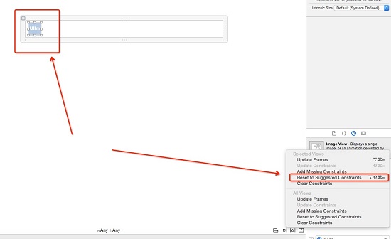
為 ImageView 加上約束:選中它,點擊 Auto Layout 按鈕即可。
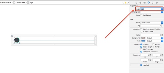
指定圖片內容。
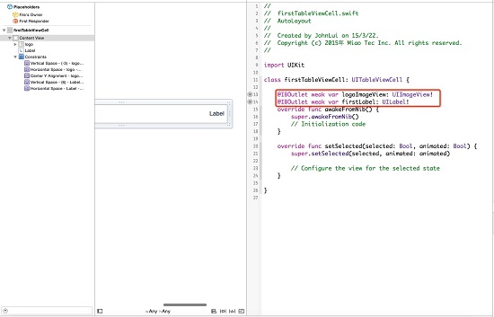
再拖入一個 UILabel,吸附到最右側並垂直居中,同樣加上約束。接著切到雙欄視圖,直接把 xib 中的元素拖曳綁定到 firstTableViewCell 類別。
先固定 cell 高度:
override func tableView(tableView: UITableView, heightForRowAtIndexPath indexPath: NSIndexPath) -> CGFloat {
    return 50
}
再給 label 填入內容:
override func tableView(tableView: UITableView, cellForRowAtIndexPath indexPath: NSIndexPath) -> UITableViewCell {
    let cell = tableView.dequeueReusableCellWithIdentifier("firstTableViewCell", forIndexPath: indexPath) as! firstTableViewCell
    cell.firstLabel.text = indexPath.row.description
    return cell
}
4.0 吋:
4.7 吋:
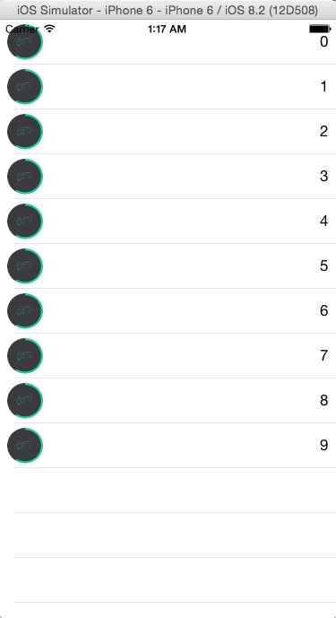
恭喜,自訂 cell 搭配 Auto Layout 已經跑通。
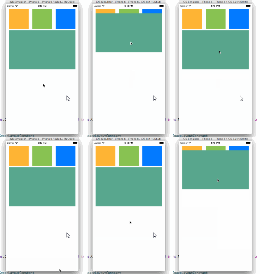
四、22 行程式碼做出拖曳回彈
這次要用 UIPanGestureRecognizer 搭配 Auto Layout,實作一個拖曳後自動回位的動畫。先刪掉首頁中間的按鈕,換成一個 view 並給它明顯的背景色,然後做絕對約束。
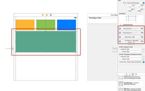
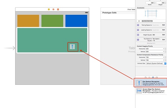
把 UIPanGestureRecognizer 拖到該 view 上。
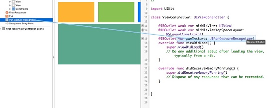
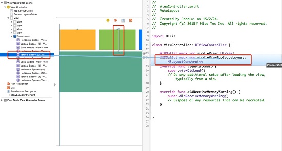
切到雙欄視圖,分別把 gesture 與該 view 的 Top Space 約束拖進 ViewController 建立 outlet。
再把 pan gesture 綁定為 action。
程式碼本體如下——關鍵在於拖動時直接改約束的 constant,放手後再用動畫把 constant 還原:
class ViewController: UIViewController {
    var middleViewTopSpaceLayoutConstant: CGFloat!
    var middleViewOriginY: CGFloat!

    @IBOutlet weak var middleView: UIView!
    @IBOutlet weak var middleViewTopSpaceLayout: NSLayoutConstraint!
    @IBOutlet var panGesture: UIPanGestureRecognizer!

    override func viewDidLoad() {
        super.viewDidLoad()
        panGesture.addTarget(self, action: Selector("pan"))
        middleViewTopSpaceLayoutConstant = middleViewTopSpaceLayout.constant
        middleViewOriginY = middleView.frame.origin.y
    }

    func pan() {
        if panGesture.state == UIGestureRecognizerState.Ended {
            UIView.animateWithDuration(0.4, delay: 0, options: UIViewAnimationOptions.CurveEaseInOut,
                animations: { () -> Void in
                    self.middleView.frame.origin.y = self.middleViewOriginY
                },
                completion: { (success) -> Void in
                    if success {
                        self.middleViewTopSpaceLayout.constant = self.middleViewTopSpaceLayoutConstant
                    }
                })
            return
        }
        let y = panGesture.translationInView(self.view).y
        middleViewTopSpaceLayout.constant = middleViewTopSpaceLayoutConstant + y
    }
}
五、依文字與圖片自動計算 Cell 高度
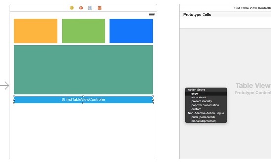
最終目標:讓 cell 高度隨內部的 UILabel 與 UIImageView 內容自動伸縮。先把首頁那顆按鈕放回來(別忘了加居中約束),恢復到 firstTableViewController 的連結。
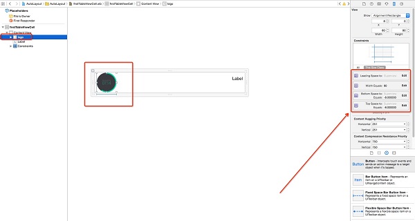
調整 firstTableViewCell 尺寸為 600×81、logo 為 80×80,並修改約束。
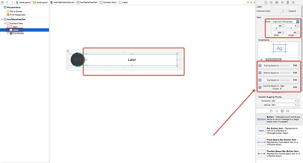
再調整 label 的尺寸與位置並補上約束。
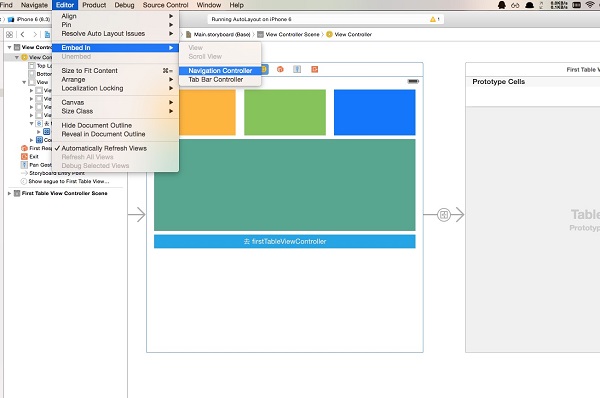
為了方便返回上一頁,替 ViewController 加上 UINavigationController 巢狀結構。
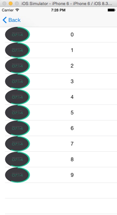
把 label 的 lines 設為 0,代表不限行數自動換行。
接著動態產生長度不一的文字內容:
class firstTableViewController: UITableViewController {
    var labelArray = Array()   // 存放 label 文字內容

    override func viewDidLoad() {
        super.viewDidLoad()
        let nib = UINib(nibName: "firstTableViewCell", bundle: nil)
        self.tableView.registerNib(nib, forCellReuseIdentifier: "firstTableViewCell")

        for i in 1...10 {
            var text = ""
            for j in 1...i {
                text += "Auto Layout"
            }
            labelArray.append(text)
        }
    }

    override func tableView(tableView: UITableView, numberOfRowsInSection section: Int) -> Int {
        return labelArray.count
    }

    override func tableView(tableView: UITableView, cellForRowAtIndexPath indexPath: NSIndexPath) -> UITableViewCell {
        let cell = tableView.dequeueReusableCellWithIdentifier("firstTableViewCell", forIndexPath: indexPath) as! firstTableViewCell
        cell.firstLabel.text = labelArray[indexPath.row]
        return cell
    }
}
最關鍵的一步是讓 cell 依內容自適應,共四個動作:
1. 用 estimatedHeightForRowAtIndexPath 取代 heightForRowAtIndexPath。這是 iOS 7 新增的 API:若列表有一萬列,heightForRowAtIndexPath 會在顯示前被呼叫一萬次,而 estimated 版本只計算當前可見的幾列,資料量大時效能差距明顯。
2. 建立一個 prototypeCell 成員以便重複使用,並在 viewDidLoad 中初始化:
var prototypeCell: firstTableViewCell!

override func viewDidLoad() {
    super.viewDidLoad()
    // ...
    prototypeCell = tableView.dequeueReusableCellWithIdentifier("firstTableViewCell") as! firstTableViewCell
}
3. 真正算出高度:
override func tableView(tableView: UITableView, estimatedHeightForRowAtIndexPath indexPath: NSIndexPath) -> CGFloat {
    let cell = prototypeCell
    cell.firstLabel.text = labelArray[indexPath.row]
    return cell.contentView.systemLayoutSizeFittingSize(UILayoutFittingCompressedSize).height + 1
}
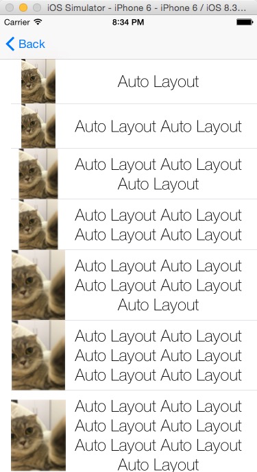
4. 檢視成果。
途中遇到的超級大坑
如果左側 UIImageView 塞進大於 80px 的圖片,畫面就會出現奇怪的結果:
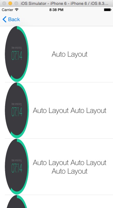
原因不是計算失效,而是圖片把 cell 撐開了。
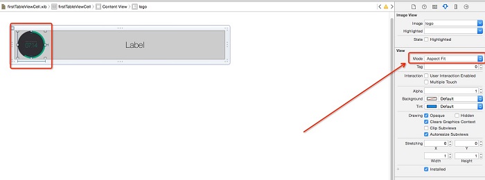
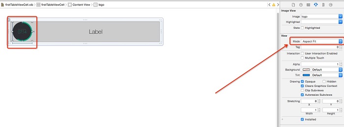
解法是「進攻就是最好的防守」——乾脆連圖片一起自適應。先把圖片的顯示模式改成 Aspect Fit。
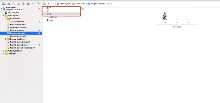
在 Images.xcassets 加入 0、1、2 三張由小到大的圖片。
在 cellForRowAtIndexPath 中指定圖片:
if indexPath.row < 3 {
    cell.logoImageView.image = UIImage(named: indexPath.row.description)
}
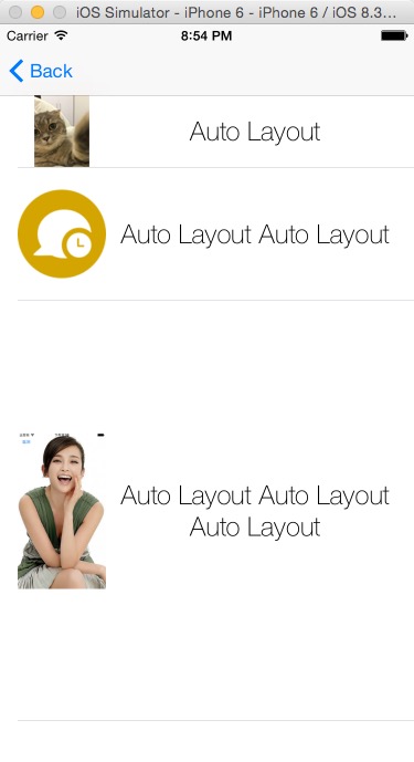
前兩列看起來正常,第三列卻多出一大片空白——這是 Auto Layout 只限制寬度為 80px 時的必然結果:寬度被壓下來了,高度卻仍是原圖的高度。解法很直接:寬度超過 80px 時,就重繪一張 80px 寬的新圖。
新增一個名為 Extensions 的 Group,在其中建立 UIImage.swift:
import UIKit

extension UIImage {
    func resizeToSize(size: CGSize) -> UIImage {
        UIGraphicsBeginImageContext(size)
        self.drawInRect(CGRectMake(0, 0, size.width, size.height))
        let newImage = UIGraphicsGetImageFromCurrentImageContext()
        UIGraphicsEndImageContext()
        return newImage
    }
}
然後在 cellForRowAtIndexPath 中套用:
if indexPath.row < 3 {
    var image = UIImage(named: indexPath.row.description)!
    if image.size.width > 80 {
        image = image.resizeToSize(CGSizeMake(80, image.size.height * (80 / image.size.width)))
    }
    cell.logoImageView.image = image
}
成果如下。
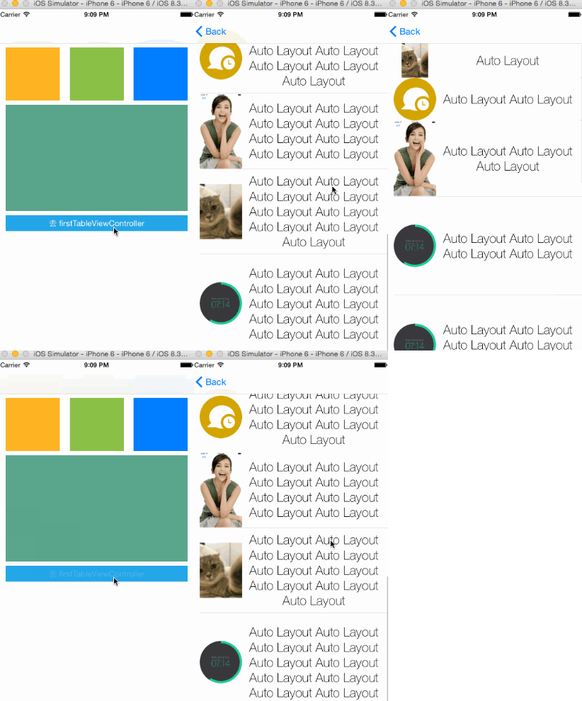
可以看到,cell 現在會依圖片與文字中較高的一方完全自適應。
致謝:感謝《動態計算 UITableViewCell 高度詳解》一文提供的基礎知識與靈感。