
6 個讓圖片上的文字更出色的 iOS 介面設計小技巧
原文:6 Hacks For Creating a Stunning User Interface。
設計師們似乎擁有著我們這些開發者所沒有的「魔力」,他們知道如何讓一個應用的介面看起來非常舒適,以至於有時讓我們迫不及待想將其復現。
然而,幾天過去了,我們仍然停留在設計稿的第一個介面,寫下大段大段的程式碼,可是介面卻不是我們想要的那個樣子,這無疑是非常惱火的一件事。
好消息是,設計師們的「魔力」並不像我們想像的那麼神奇,其中有一些關於設計的小技巧。只要掌握了它們,我們就能以最小的代價讓使用者介面變得好看起來。
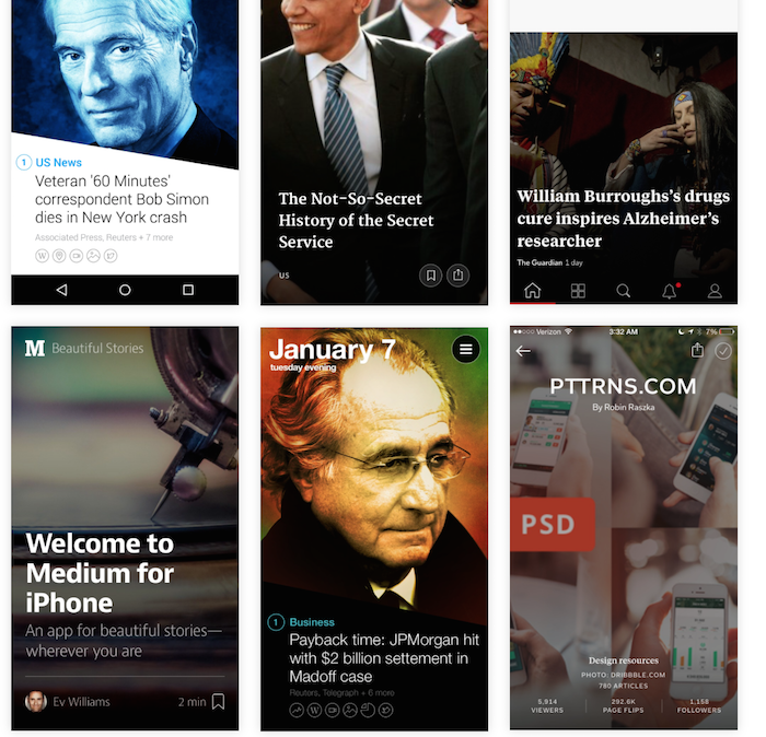
今天,我將給大家展示其中的一些小技巧,我更樂意稱它們為「圖片標記技巧」,大意就是如何在一幅圖片上放文字會更好看。我們在 iOS 模板中使用了這些技巧,這也是我們能夠搭建出色使用者介面的訣竅之一。
這些設計理念也可以用來處理表視圖單元格(Table View Cell)與集合視圖(Collection View)。
我們不能直接把文字扔到圖片上,然後指望它「Duang」地一下出現那個 Feel。不過,跟隨以下 6 條小技巧就能實現我們的目的了:
1:加文字
嗯,我不會忘記我說過,直接把文字扔到圖片上並不能讓它變得好看。不過有些時候我們或許會走狗屎運,就像下圖這個例子一樣。這種設計看起來很讚,是因為標題比其他文字元素要大一些。
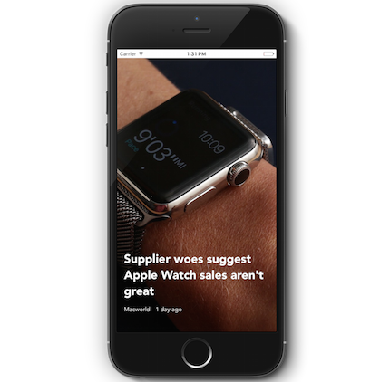
並且,這種效果一般只會發生在文字位於圖片深色部分的情況。如果不是這樣,就會像下面這個例子一樣。現在我們換了一篇有其他封面的文章,啊偶,GG。
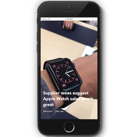
好吧,怎麼辦?
2:加圖片遮罩
我們可以直接在圖片上加一個遮罩,技巧就是透過這個遮罩讓圖片變得更暗、更透明,或者直接刷上顏色,就像 Yahoo 新聞做的那樣。
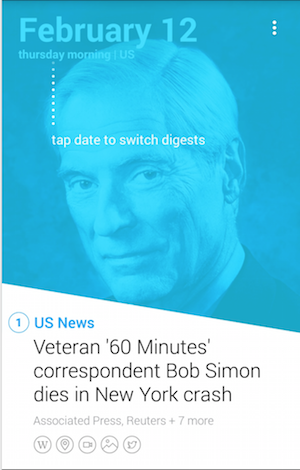
好的,在這個例子中,由於底色是藍色、文字顏色是白色,所以看起來效果很讚。
下面這個例子是我們目前正在製作的專案截圖,接下來就是我們實現這個效果的程式碼:
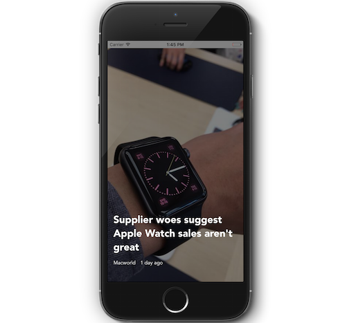
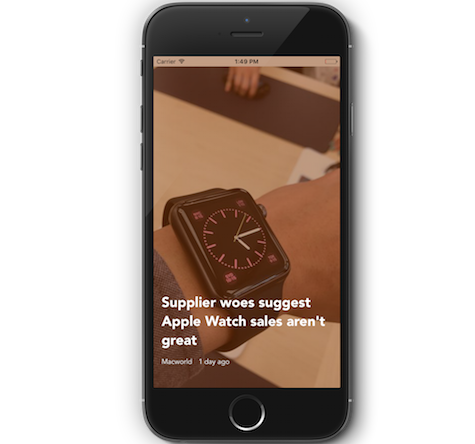
func addFullOverlay(){ let overlayView = UIView(frame: CGRectZero) overlayView.translatesAutoresizingMaskIntoConstraints = false overlayView.backgroundColor = UIColor(red: 0, green: 0, blue: 0, alpha: 0.5) self.view.insertSubview(overlayView, aboveSubview: coverImageView) let topConstraint = NSLayoutConstraint(item: overlayView, attribute: .Top, relatedBy: .Equal, toItem: self.view, attribute: .Top, multiplier: 1, constant: 0) let leftConstraint = NSLayoutConstraint(item: overlayView, attribute: .Left, relatedBy: .Equal, toItem: self.view, attribute: .Left, multiplier: 1, constant: 0) let rightConstraint = NSLayoutConstraint(item: overlayView, attribute: .Right, relatedBy: .Equal, toItem: self.view, attribute: .Right, multiplier: 1, constant: 0) let bottomConstraint = NSLayoutConstraint(item: overlayView, attribute: .Bottom, relatedBy: .Equal, toItem: self.view, attribute: .Bottom, multiplier: 1, constant: 0) view.addConstraints([topConstraint, leftConstraint, rightConstraint, bottomConstraint]) }不過這個效果不是很理想,因為圖片現在的顏色很陰暗,文字就特別突兀,但這或許正是你追求的樣子。透過給遮罩加一點著色,我們就能像 Instagram 那樣,給圖片加個「濾鏡」效果,如下圖所示。
我們只需給這個半透明的遮罩加上顏色就可以了:
overlayView.backgroundColor = UIColor(red: 0.5, green: 0.2, blue: 0, alpha: 0.5)
3:加文字背景
有些人並不喜歡遮罩這個做法,因為他們可能想讓圖片保持「原汁原味」。這樣的話,我們就要使用這個技巧了,就像「Funny or Die」所做的那樣。

以我們的專案來距離,我們可以給文字加上背景。透過文字的 NSAttributed 屬性,我們可以輕易完成這項操作。
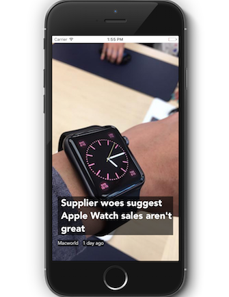
實現這項效果的程式碼如下:
func addBackgroundColorToText() { let style = NSMutableParagraphStyle.defaultParagraphStyle().mutableCopy() as! NSMutableParagraphStyle style.firstLineHeadIndent = 10.0 style.headIndent = 10 style.tailIndent = 0 let attributes = [NSParagraphStyleAttributeName : style] let attributedTitleText = NSAttributedString(string: "Supplier woes suggest Apple Watch sales aren't great", attributes: attributes) titleLabel.attributedText = attributedTitleText let textbackgroundColor = UIColor(red: 0, green: 0, blue: 0, alpha: 0.6) titleLabel.backgroundColor = textbackgroundColor authorLabel.backgroundColor = textbackgroundColor dateLabel.backgroundColor = textbackgroundColor }4:加有顏色的背景
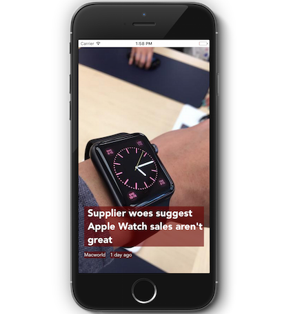
呃,和上面那個效果類似,如果你不喜歡黑色的話,可以更換文字背景的顏色,這樣就有了「有顏色的文字背景」。至於如何實現這個效果,就留給你去嘗試了 O(∩_∩)O~關鍵在於找到圖片的主色,然後將其設為背景顏色。
5:加毛玻璃
這是我最喜歡的效果,沒有之一。透過 iOS 8 提供的 UIVisualEffectView 類,我們可以輕鬆實現它。我們在 Newsstand 範例中使用了這項效果,透過把文字下方的圖片加上毛玻璃效果,可以讓文字更易讀。
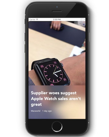
以下是實現這個效果的程式碼:
func addBlurView(){ let effect = UIBlurEffect(style: .Light) let overlayView = UIVisualEffectView(effect: effect) overlayView.translatesAutoresizingMaskIntoConstraints = false self.view.insertSubview(overlayView, aboveSubview: coverImageView) let topConstraint = NSLayoutConstraint(item: overlayView, attribute: .Top, relatedBy: .Equal, toItem: self.titleLabel, attribute: .Top, multiplier: 1, constant: -30) let leftConstraint = NSLayoutConstraint(item: overlayView, attribute: .Left, relatedBy: .Equal, toItem: self.view, attribute: .Left, multiplier: 1, constant: 0) let rightConstraint = NSLayoutConstraint(item: overlayView, attribute: .Right, relatedBy: .Equal, toItem: self.view, attribute: .Right, multiplier: 1, constant: 0) let bottomConstraint = NSLayoutConstraint(item: overlayView, attribute: .Bottom, relatedBy: .Equal, toItem: self.view, attribute: .Bottom, multiplier: 1, constant: 0) view.addConstraints([topConstraint, leftConstraint, rightConstraint, bottomConstraint]) }6:加暗色漸變
這是我第二喜歡的效果,有些時候甚至比毛玻璃還要好看一些。
這個效果是透過在文字下方加上一個「暗色漸變」(gradient fade)圖層,顏色從半透明的黑色漸變到不透明的黑色,看起來效果很讚。
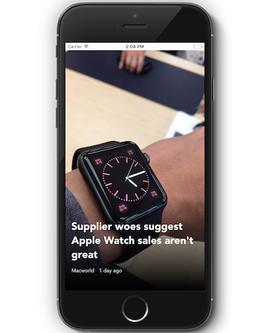
這個效果用在了很多應用上,比如 Flipboard 以及許多部落格應用。我們也可以發現 Hotel Tonight 應用中也應用了這個效果。
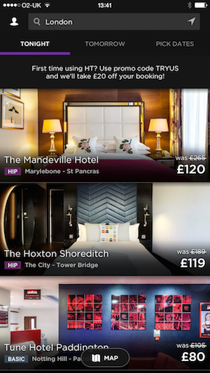
要實現這個效果,你可以使用以下程式碼:
func addGradientOverlay(){ self.view.insertSubview(gradientView, aboveSubview: coverImageView) gradientLayer.frame = gradientView.bounds let opaqueBlackColor = UIColor(red: 0, green: 0, blue: 0, alpha: 1.0).CGColor let transparentBlackColor = UIColor(red: 0, green: 0, blue: 0, alpha: 0.0).CGColor gradientLayer.colors = [transparentBlackColor, opaqueBlackColor] gradientView.layer.insertSublayer(gradientLayer, atIndex: 0) gradientView.translatesAutoresizingMaskIntoConstraints = false self.view.insertSubview(gradientView, aboveSubview: coverImageView) let topConstraint = NSLayoutConstraint(item: gradientView, attribute: .Top, relatedBy: .Equal, toItem: self.titleLabel, attribute: .Top, multiplier: 1, constant: -60) let leftConstraint = NSLayoutConstraint(item: gradientView, attribute: .Left, relatedBy: .Equal, toItem: self.view, attribute: .Left, multiplier: 1, constant: 0) let rightConstraint = NSLayoutConstraint(item: gradientView, attribute: .Right, relatedBy: .Equal, toItem: self.view, attribute: .Right, multiplier: 1, constant: 0) let bottomConstraint = NSLayoutConstraint(item: gradientView, attribute: .Bottom, relatedBy: .Equal, toItem: self.view, attribute: .Bottom, multiplier: 1, constant: 0) view.addConstraints([topConstraint, leftConstraint, rightConstraint, bottomConstraint]) }下載範例專案
是不是很喜歡這些效果呢?現在你已經知道如何實現,那麼就可以在你的應用中使用它們了。點擊此處來下載範例專案,這樣可以看到所有已實現的效果。
關於更多設計技巧相關的內容,可以參閱 Medium 網站上的文章。如果你有更好的想法,請與我聯繫。
- 上一篇文章: 如何用程式碼控制以不同螢幕方向打開新頁面【iOS】
- 下一篇文章: 超詳細:iOS 並發編程之 Operation Queues 完全指南