
React Native 深入解析 TabBarIOS 組件與頁面切換
前言
學習本系列內容需要具備一定的 HTML 開發基礎,沒有基礎的朋友可以先參考 HTML 快速入門系列。筆者接觸 React Native 的時間並不算長,對部分內容的性質理解難免有偏差,若發現錯誤會隨時修正,也歡迎各路朋友批評指正。
TabBarIOS 組件簡介
現今大部分 App 都採用選項卡切換的設計,例如微信、微博、QQ 空間等。在原生 iOS 中,我們可以透過 TabBarController 實現;而在 React Native 裡,則可以運用 TabBarIOS 搭配 TabBarIOS.Item 組件來打造相同的底部標籤切換效果。
顧名思義,這個組件名稱帶有 IOS 字樣,因此僅支援 iOS 平台,並不支援 Android。若要在 Android 上實作類似效果,後續可透過自定義組件來滿足需求。
TabBarIOS 常見屬性
它繼承了 View 的所有屬性,此外還有:
barTintColor:標籤欄的背景顏色tintColor:當前被選中標籤圖標的顏色translucent:布林值,決定標籤欄是否需要半透明效果
TabBarIOS.Item 常見屬性
同樣繼承自 View,主要屬性包括:
badge:圖標右上角顯示的紅色角標icon:為當前標籤指定自定義圖標(若定義了systemIcon則會被忽略)onPress:點擊此標籤時的回呼,你應該修改組件狀態使selected={true}selected:決定子視圖是否可見,若看到空白頁面,很可能是沒有選中任何標籤selectedIcon:標籤被選中時顯示的自定義圖標systemIcon:一些預定義的系統圖標,可選值有 'bookmarks'、'contacts'、'downloads'、'favorites'、'featured'、'history'、'more'、'most-recent'、'most-viewed'、'recents'、'search'、'top-rated'title:在圖標下方顯示的標題文字(若定義了systemIcon則會被忽略)
TabBarIOS 初體驗
首先引入組件:
import { TabBarIOS } from 'react-native'; 使用 TabBarIOS 很簡單,但必須搭配 TabBarIOS.Item。特別需要注意的是,我們必須為 TabBarIOS 明確設置尺寸,否則可能出現實例化成功卻看不見的情況。
render() { return ( <View style={styles.container}> <TabBarIOS style={{height:49, width: width}} > </TabBarIOS> </View> ); } 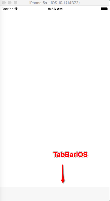
接著為它添加 Item(TabBarIOS 最多只能包含 5 個 Item,超出的部分會用 more 圖標代替):
render() { return ( <View style={styles.container}> <TabBarIOS style={{height:49, width: width}} > <TabBarIOS.Item systemIcon="bookmarks"></TabBarIOS.Item> <TabBarIOS.Item systemIcon="contacts"></TabBarIOS.Item> <TabBarIOS.Item systemIcon="downloads"></TabBarIOS.Item> <TabBarIOS.Item systemIcon="favorites"></TabBarIOS.Item> <TabBarIOS.Item systemIcon="history"></TabBarIOS.Item> </TabBarIOS> </View> ); } 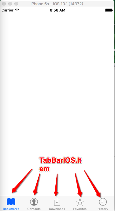
接著我們嘗試修改屬性看看效果。被選中標籤顏色:
<TabBarIOS style={{height:49, width: width}} tintColor="green"></TabBarIOS> 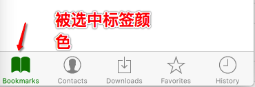
背景色:
<TabBarIOS style={{height:49, width: width}} tintColor="green" barTintColor="black"></TabBarIOS> 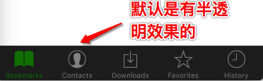
是否半透明:
<TabBarIOS style={{height:49, width: width}} tintColor="green" barTintColor="black" translucent={false}></TabBarIOS> 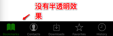
角標(角標位置會受到右側空間影響,當位置不足時會自動往左移動以保證顯示完整):
<TabBarIOS.Item systemIcon="bookmarks" badge="99999999"></TabBarIOS.Item> <TabBarIOS.Item systemIcon="contacts" badge="15"></TabBarIOS.Item> <TabBarIOS.Item systemIcon="downloads" badge="@$!@"></TabBarIOS.Item> 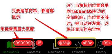
自定義圖標(目前僅支援本地圖片):
<TabBarIOS.Item renderAsOriginal={true} icon={require('image!home')}></TabBarIOS.Item> 
TabBarIOS.Item 點擊與頁面切換
很多人會發現 TabBarIOS.Item 無法直接接收點擊事件來切換界面,這裡要重點講解 selected 與 onPress 兩個屬性的搭配使用。
首先要為各個 Item 設置對應的子頁面:
<TabBarIOS.Item systemIcon="bookmarks"> <View style={[styles.childViewStyle, {backgroundColor:'yellow'}]}></View> </TabBarIOS.Item> <TabBarIOS.Item systemIcon="contacts"> <View style={[styles.childViewStyle, {backgroundColor:'blue'}]}></View> </TabBarIOS.Item> 頁面切換的核心,在於根據 selected 是否為 true 決定重新渲染哪個界面。由於涉及重新渲染,需要使用狀態機 getInitialState。
首先定義一個初始化變量記錄當前選中的 item:
getInitialState(){ return{ selectedTabItem:0 } }, 點擊時透過 onPress 更新狀態:
onPress={() => {this.setState({selectedTabItem:0})}} 再根據狀態變量決定顯示哪個頁面(狀態改變後,狀態機會再次調用 render,進而觸發 selected 屬性):
selected={this.state.selectedTabItem == 0} 完整視圖代碼如下:
var TabBarIOSDemo = React.createClass({ getInitialState(){ return{ selectedTabItem:0 } }, render() { return ( <View style={styles.container}> <TabBarIOS style={{height:49, width: width}} tintColor="green" barTintColor="black" translucent={false} > <TabBarIOS.Item systemIcon="bookmarks" onPress={() => {this.setState({selectedTabItem:0})}} selected={this.state.selectedTabItem == 0} > <View style={[styles.childViewStyle, {backgroundColor:'yellow'}]}></View> </TabBarIOS.Item> <TabBarIOS.Item systemIcon="contacts" onPress={() => {this.setState({selectedTabItem:1})}} selected={this.state.selectedTabItem == 1} > <View style={[styles.childViewStyle, {backgroundColor:'blue'}]}></View> </TabBarIOS.Item> </TabBarIOS> </View> ); } }); 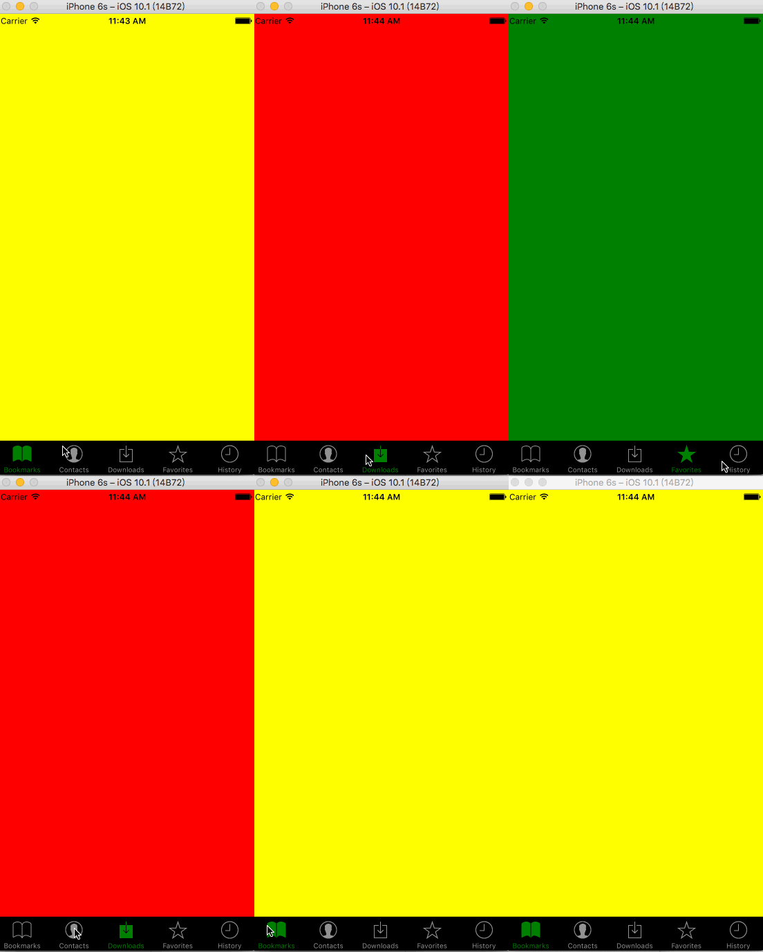
補充:數組樣式
上文出現過 [styles.childViewStyle, {backgroundColor:'yellow'}] 這樣的寫法,可能讓初學者困惑。實際上在 JS 中,樣式可以透過數組形式傳遞,React 會自動解析並依優先級選擇要套用的屬性。

實際開發中,我們通常會把代碼抽離,讓結構更清晰,這部分會在後續綜合項目中介紹。